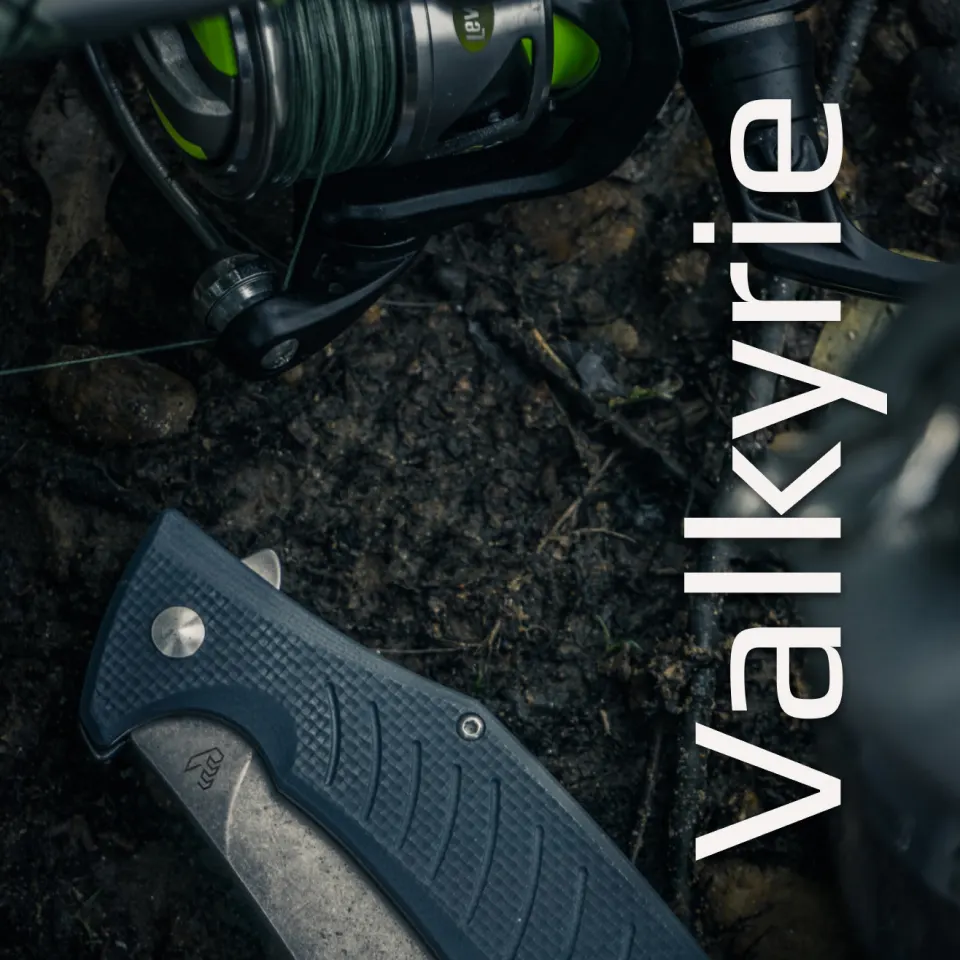
Valkyrie
Valkyrie has been handcrafting exquisite blades for over 40 years. Their target audience is knife enthusiasts & collectors who appreciate / value a well designed blade.

Logo & Colors
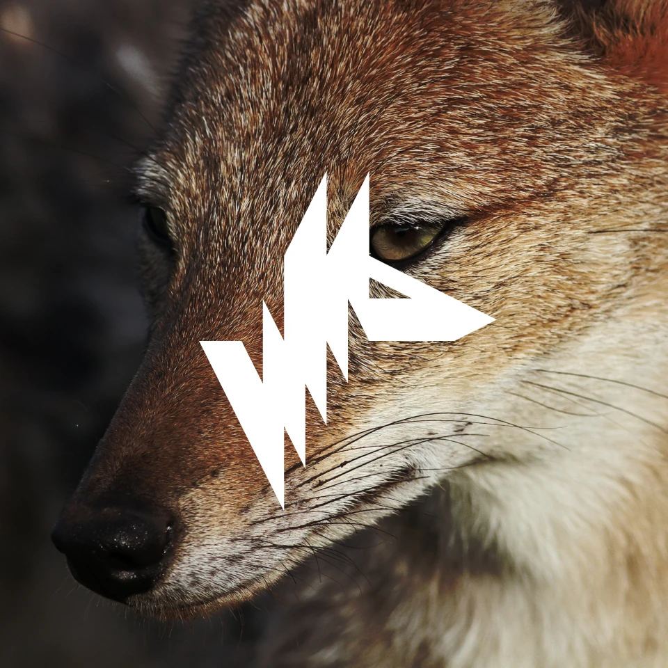
The logo is a sharp, but elegant mono-line mark in the shape of a “V” and a half-open pocket knife. The color palette is modest yet refined, pointing to Valkyrie’s nature and premium quality.


Classically Handcrafted
Valkyrie hand-picks their designers from all over the world to provide new and unique blade styles, utilizing tried-and-true techniques. All the knives are named after characters & material from Norse mythology.
Stay Sharp
The typography mirrors the logo with it’s thin lines and sharp look. The logo lends itself to many unique patterns, with some reading as “V”s and others reading as knives.
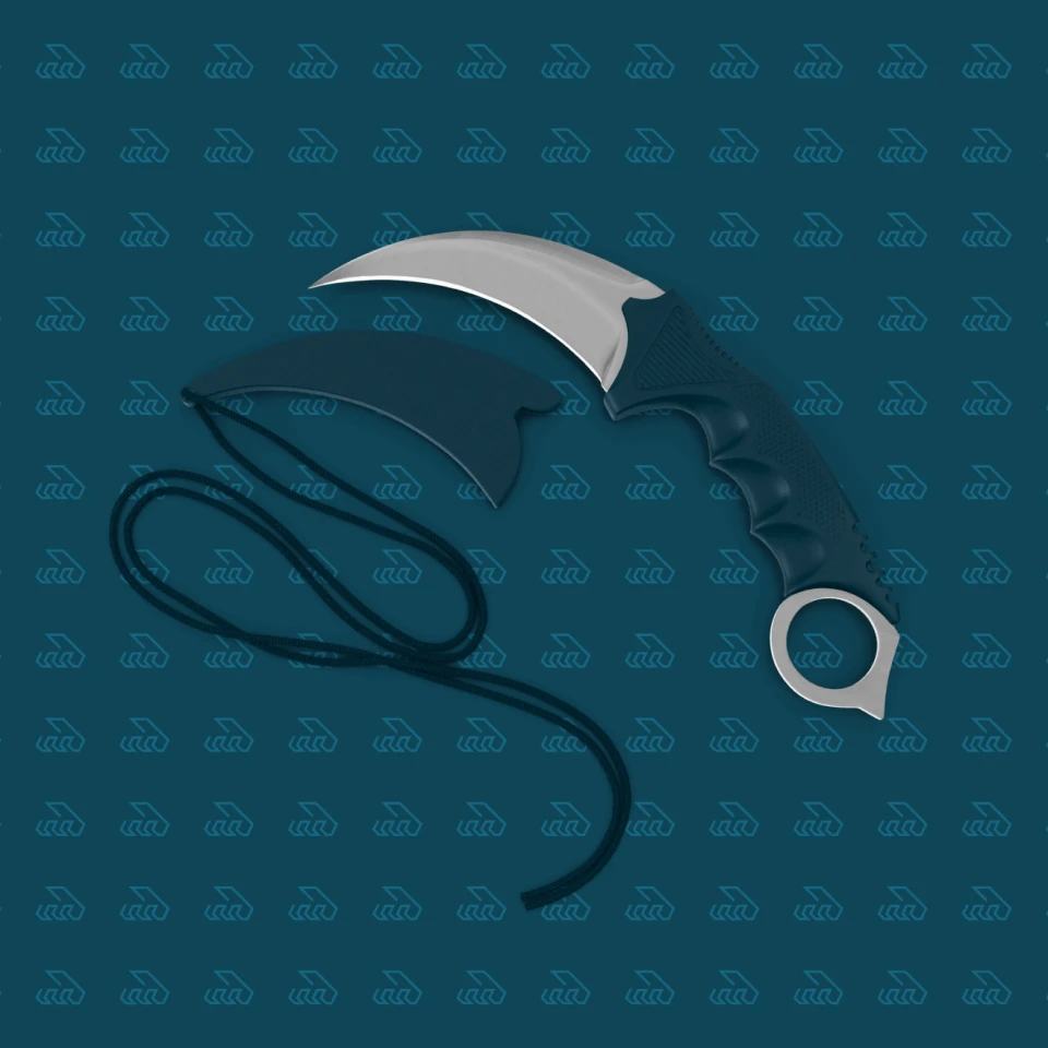
Knives for Sale
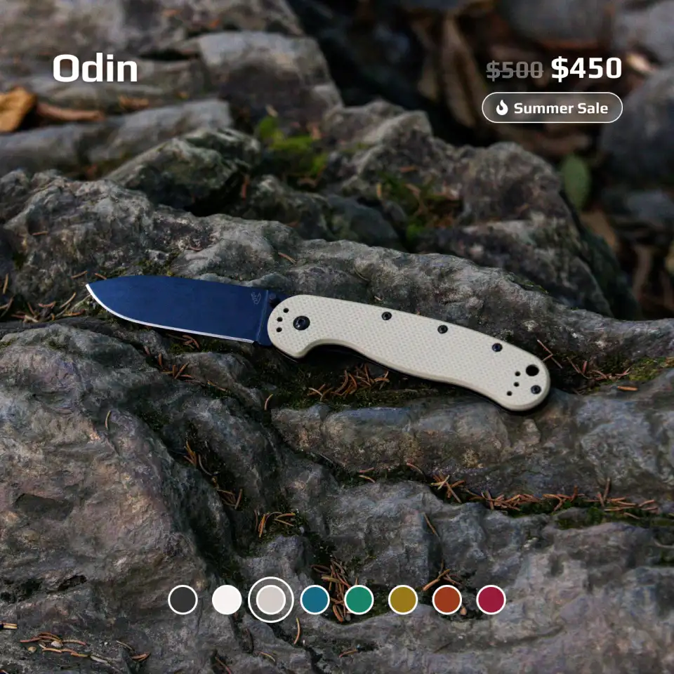
One of the next steps for Valkyrie is to spin up their new website, so I put together a few examples of how that could look with the new brand assets.

V is for Versatility
Knives come in many different shapes, sizes, materials, colors, etc… so the mark and the color scheme had to adapt accordingly. Several iterations of both the type and the mark were created to future-proof the design.

Final Thoughts
This project was so much fun. I’ve always been interested in EDC and knives in general, so getting to research in this space was a joy. The final deliverables came out great and should last for years and years to come!