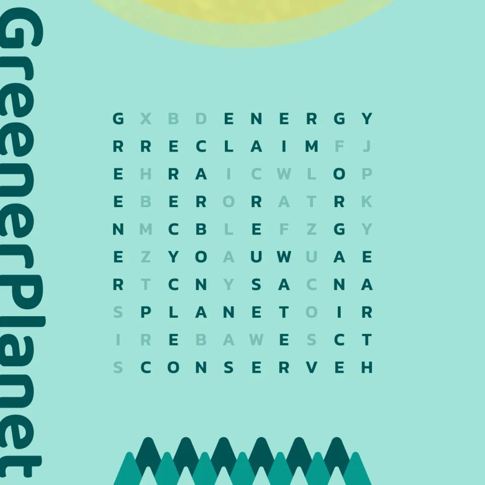
Greener Planet

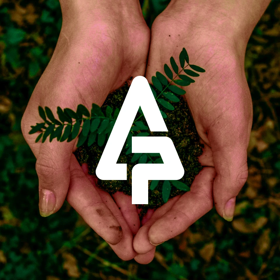
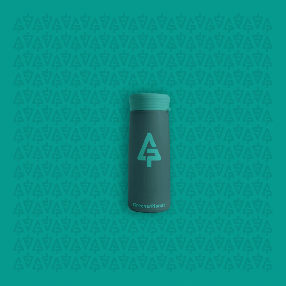
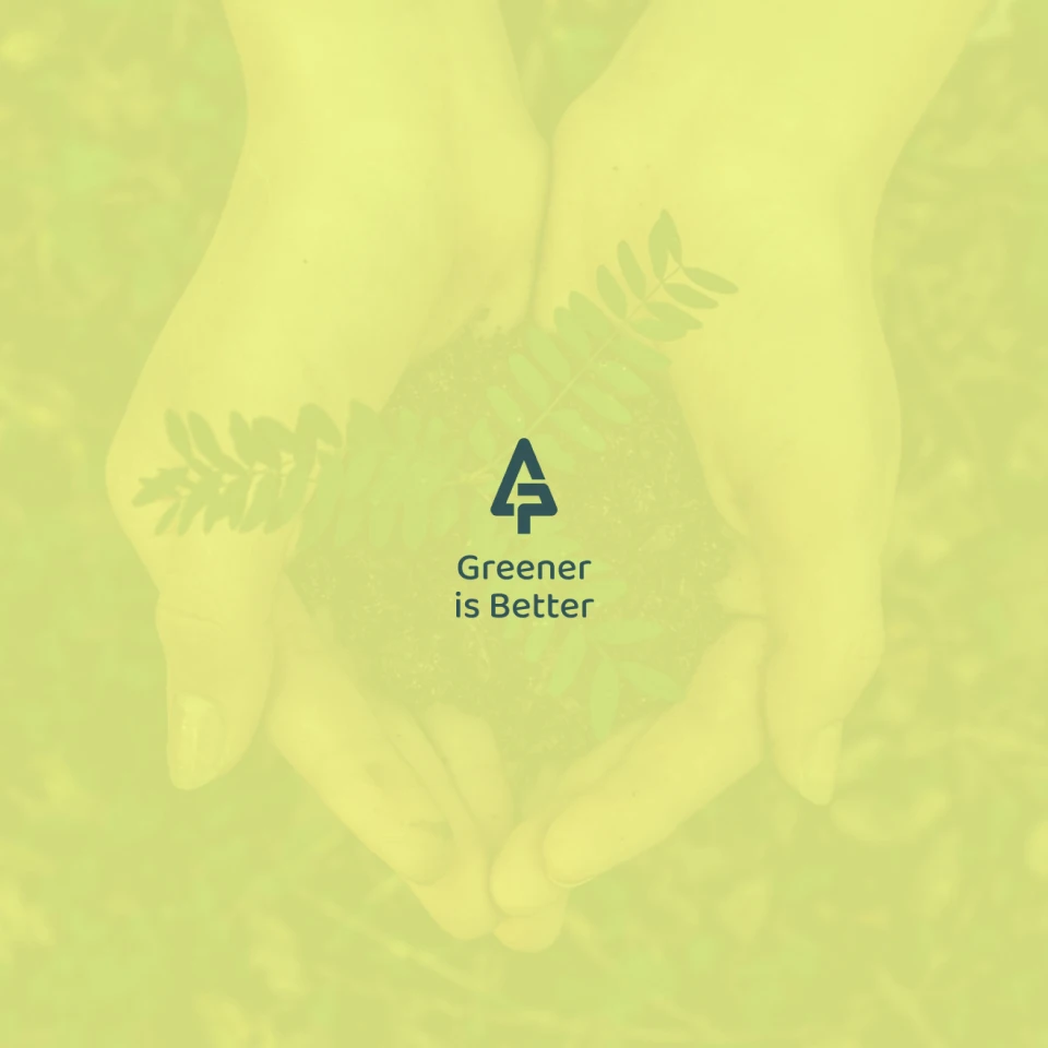
Logo & Colors
The logo is a simple abstract “GP” monogram, combined with a tree and a cycle-like structure. The color palette is fresh, calm and pleasant, reminding viewers of the peace and quiet green spaces provide.


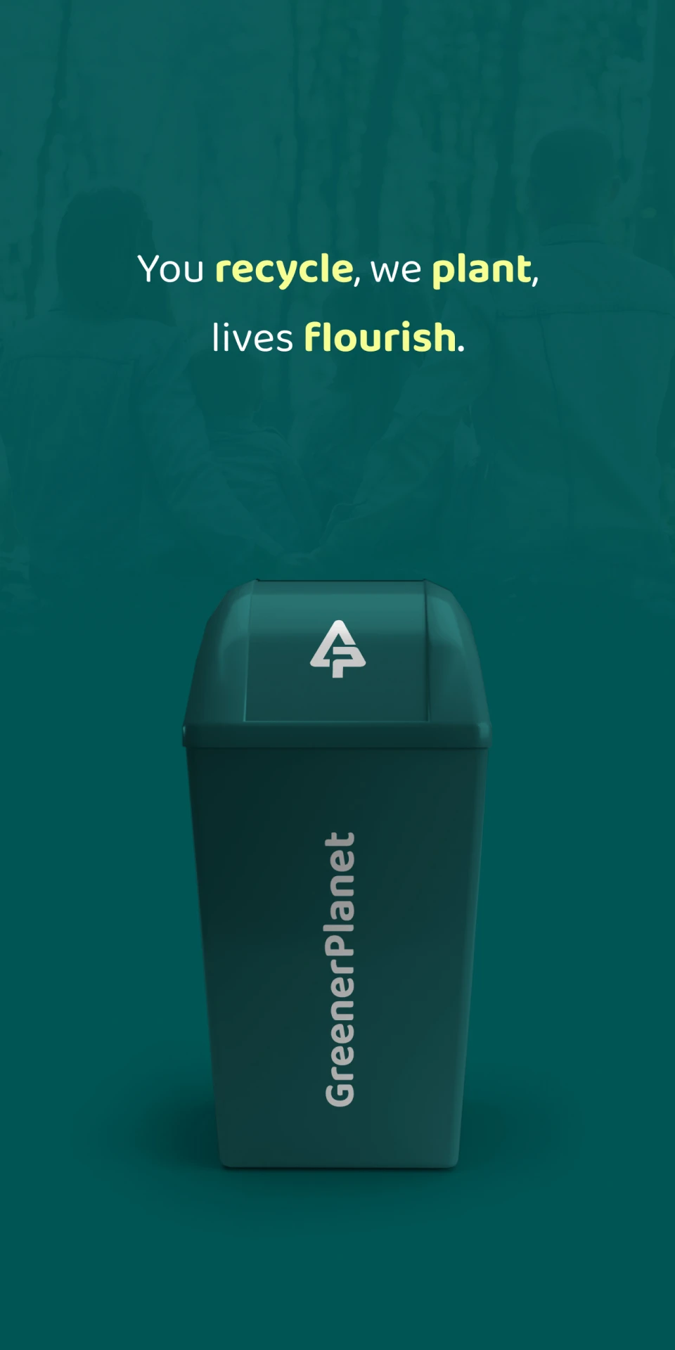
Recycle & Rebuild
Greener Planet offers 3 different size boxes. Once you have your box, you just stuff it full of everything you haven’t been able to get rid of, make sure it shuts, and take it to a drop-off location. Greener Planet will plant a tree for every box purchased.
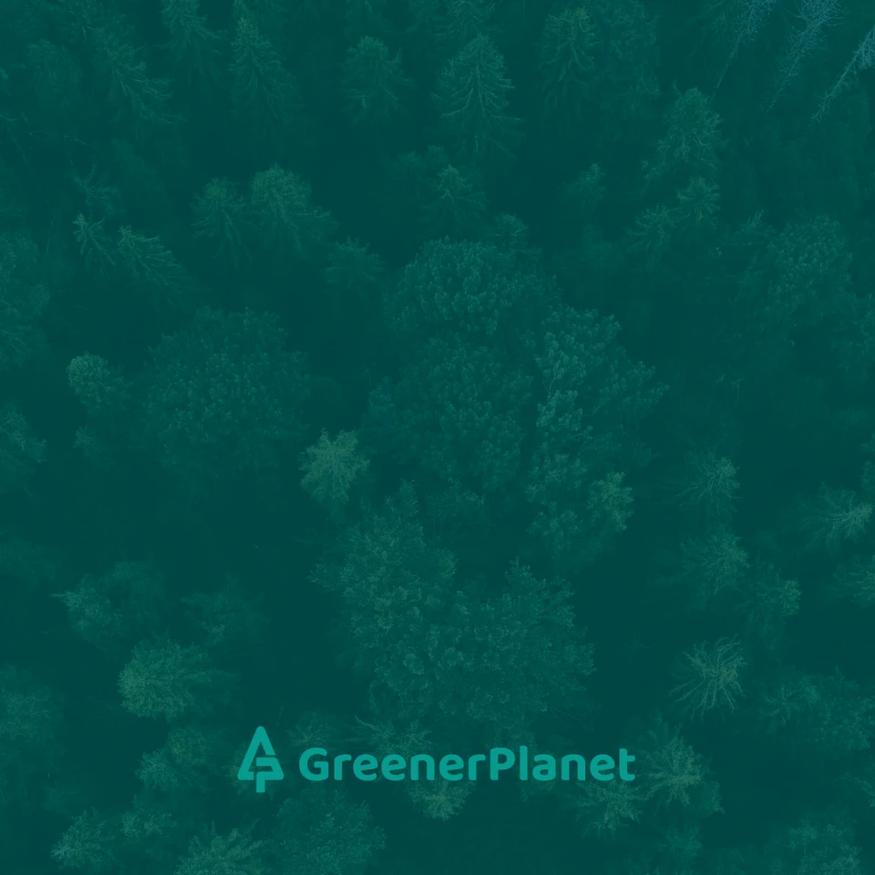
Back to Our Roots
Greener Planet believes we should slow down, consume less and spend more time in nature. The softer colors and imagery emphasize the belief that not everything has to be vying for our attention at all times.
Green Around the Edges
An interesting idea that came up during a brainstorming session was to get children involved with Greener Planet by setting up community gardens at and around local schools.

Final Thoughts
Greener Planet’s brand is understated, but seeks to leave an impression. The subtle green color scheme is comforting while the yellow accent color can be used to draw the attention to important elements. And the logo is a nod to well-known recycle marks around the world, while still being unique and memorable.