Polaris
collective services to businesses in need.

Logo & Colors
The logo is a graphical representation of the North Star, Polaris… created from the letter “A” (sans crossbar) rotated about a central point. The color palette is based on the beautiful warm colors in the night sky after a sunset.


Clear & Innovative
Polaris is there to guide their clients down the right path in the ever-evolving world of technology. The brand elements focus on stars and space for consistency and to give off the sense of higher / forward thinking.


The Stars at Night
Much of their media (website, ads, decor) will feature “dark mode” to ensure their brand is viewed as a guiding light in the darkness, as well as separating them from their competition.
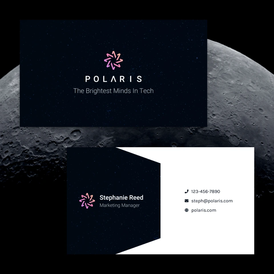
Written in the Cards
Business cards are often some of the first assets a new company requests. In this case we went with something super simple/memorable. The design on the back mimics an open door, inviting the reader inside.

Final Thoughts
Polaris features a mark that just feels “right”, which is exciting as it was one of the first concepts that came to mind. Perfecting the angles and white space took some time, but the final result is simple yet elegant.