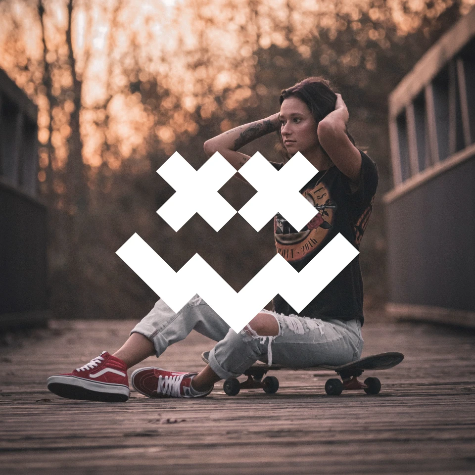
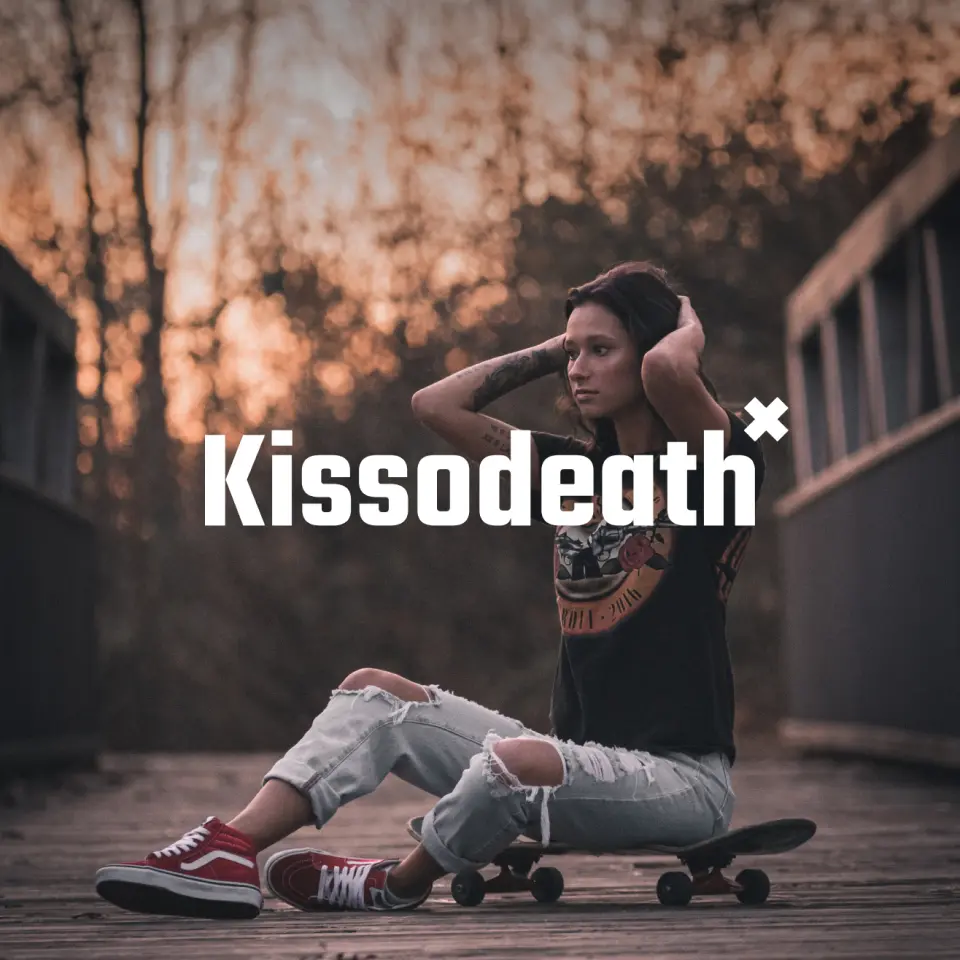
Kissodeath
Kissodeath is a fictional skate brand focused on empowerment & fearlessness. The brand is primarily targeted at younger women who are breaking through boundaries & stereotypes.

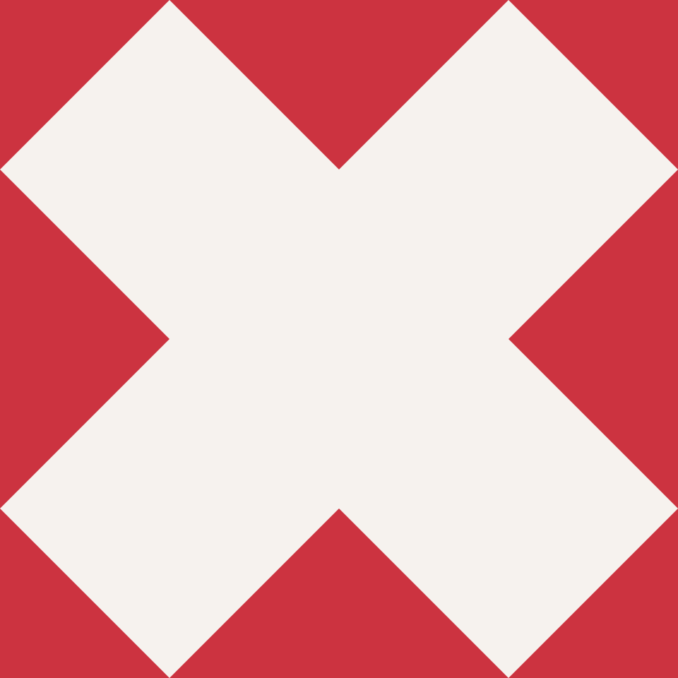
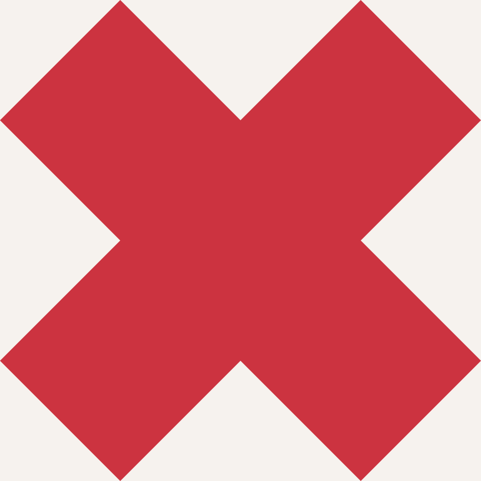
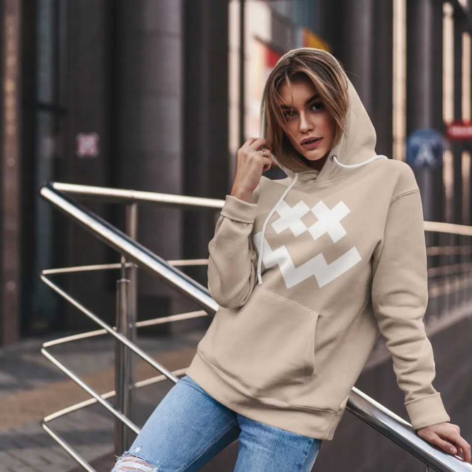
Logo & Colors
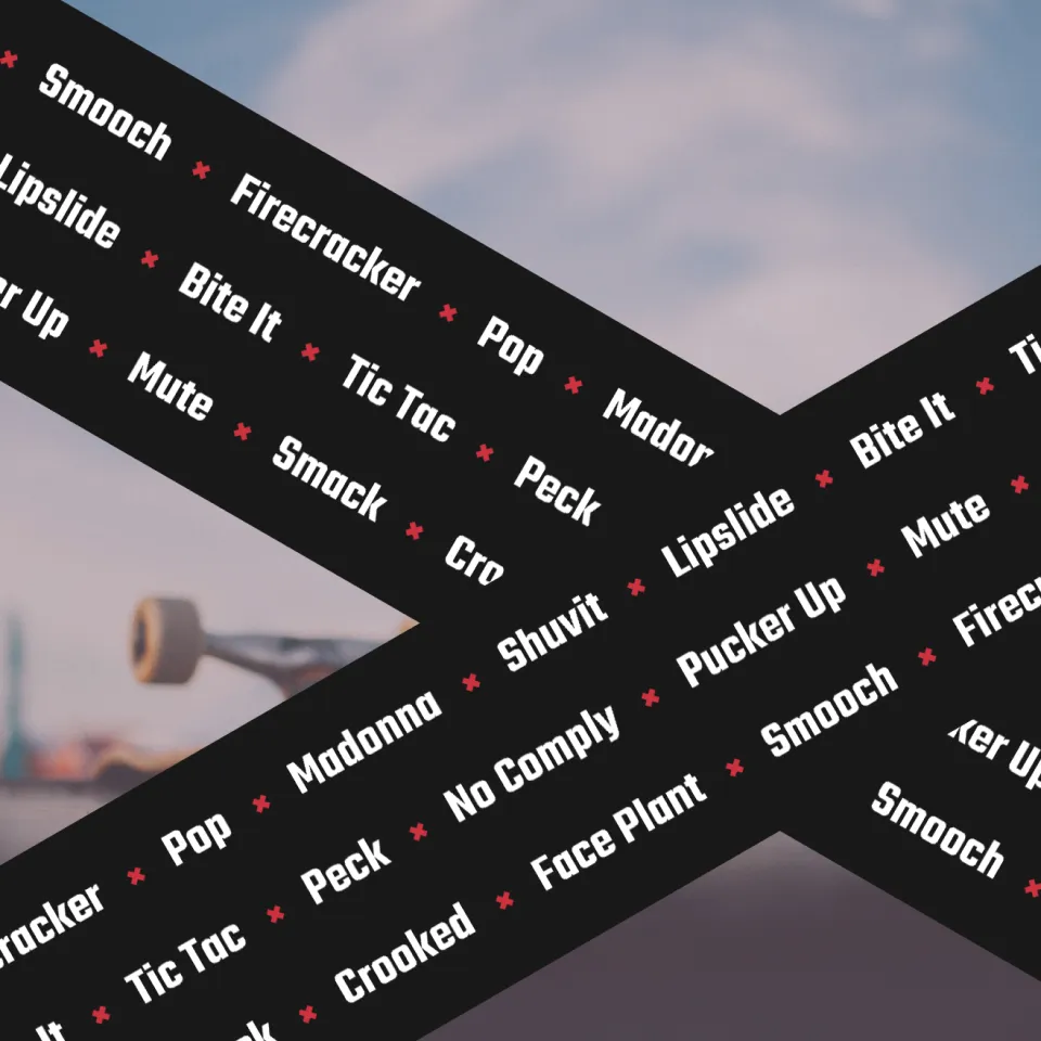
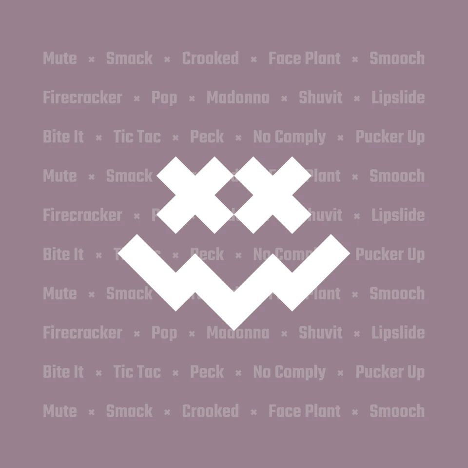
The logo is bold and slightly irreverent, combining a smiley face, a dead face emoji and an “XX” that can informally stand for kisses or chromosomes. The color palette represents rebellion from the status quo.
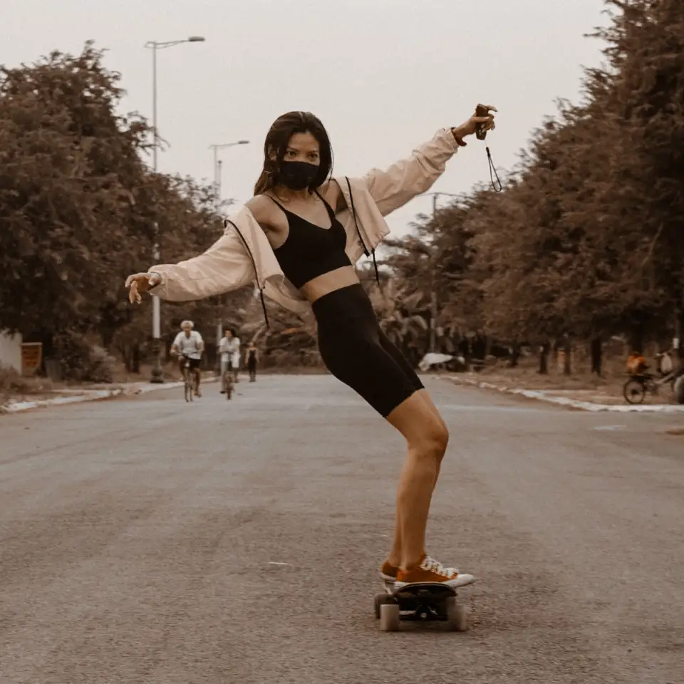
Bold & Fearless
Kissodeath encourages and empowers their fans to focus on what they love and skate on past people who keep trying to put ‘em in a box. The brand colors & imagery allow for a rebellious and/or laid-back vibe.
Authentic Originality
What makes you unique is what makes you exciting. Embrace it! Kissodeath invites you to live unashamed and skate boldly, whether that’s skating solo through your neighborhood or competing against the top talent in an X Games final.
Join the Rebellion
There’s a time to join forces and fight back, and there’s a time to relax and do something for ourselves… but one thing we won’t do is conform. Society wishes to put everyone in a box. Not us.

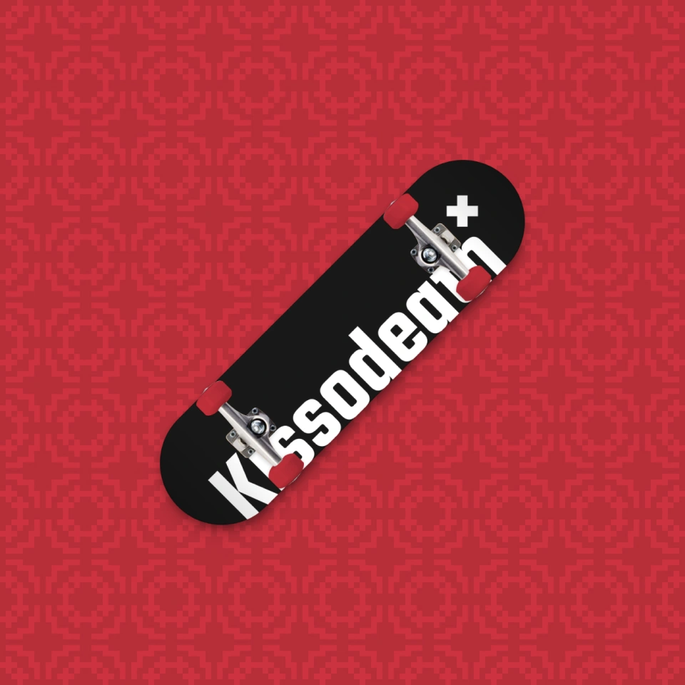
Decks on Decks on Decks
I designed a variety of skateboard decks utilizing all the brand assets I created / curated. This is where the designs really came to life! I think I’d probably rock the clean natural wood “Kissodeath” or the “Hands on Eyes” art deck.
Final Thoughts
This brand inspired me. Once I came up with the memorable “smile” mark, everything else just seemed to click. Designing the skateboard decks was easily my favorite part, being able to use my graphic design skills to bring the brand to life.