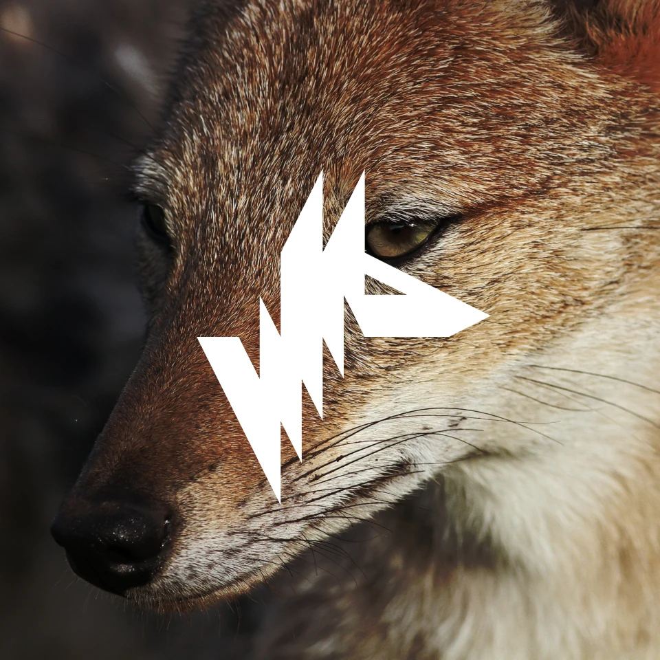
Jackal

Logo & Colors
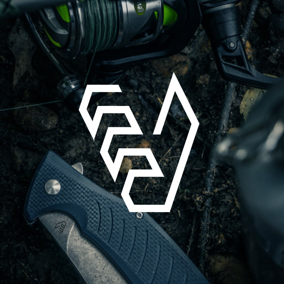
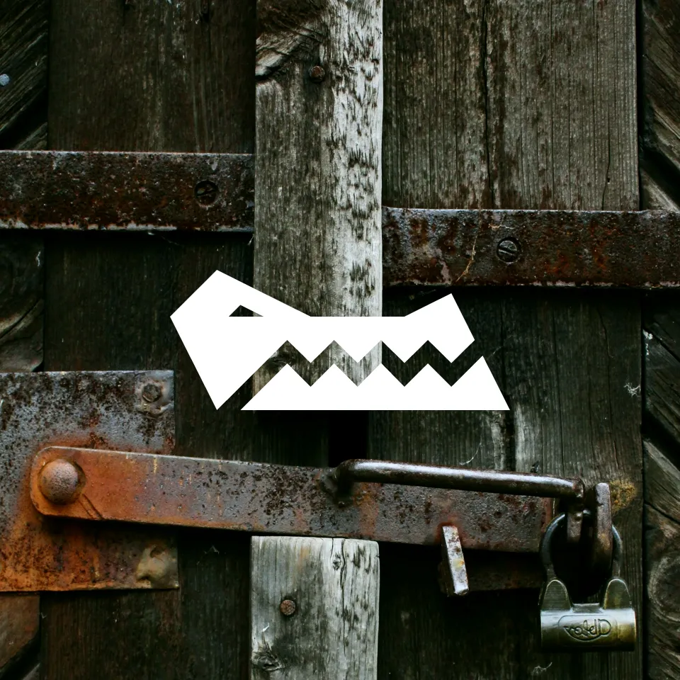
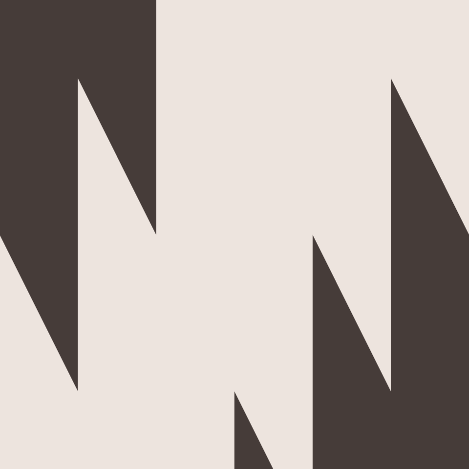
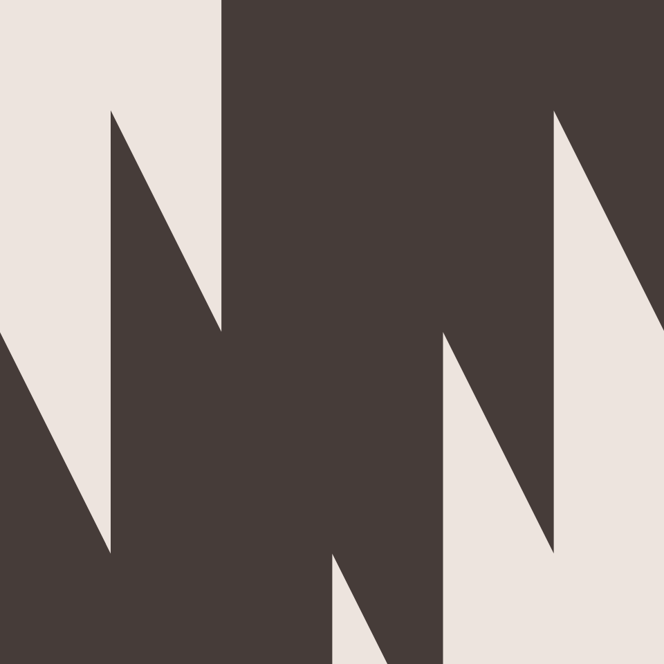
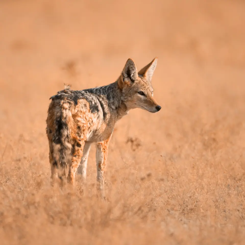
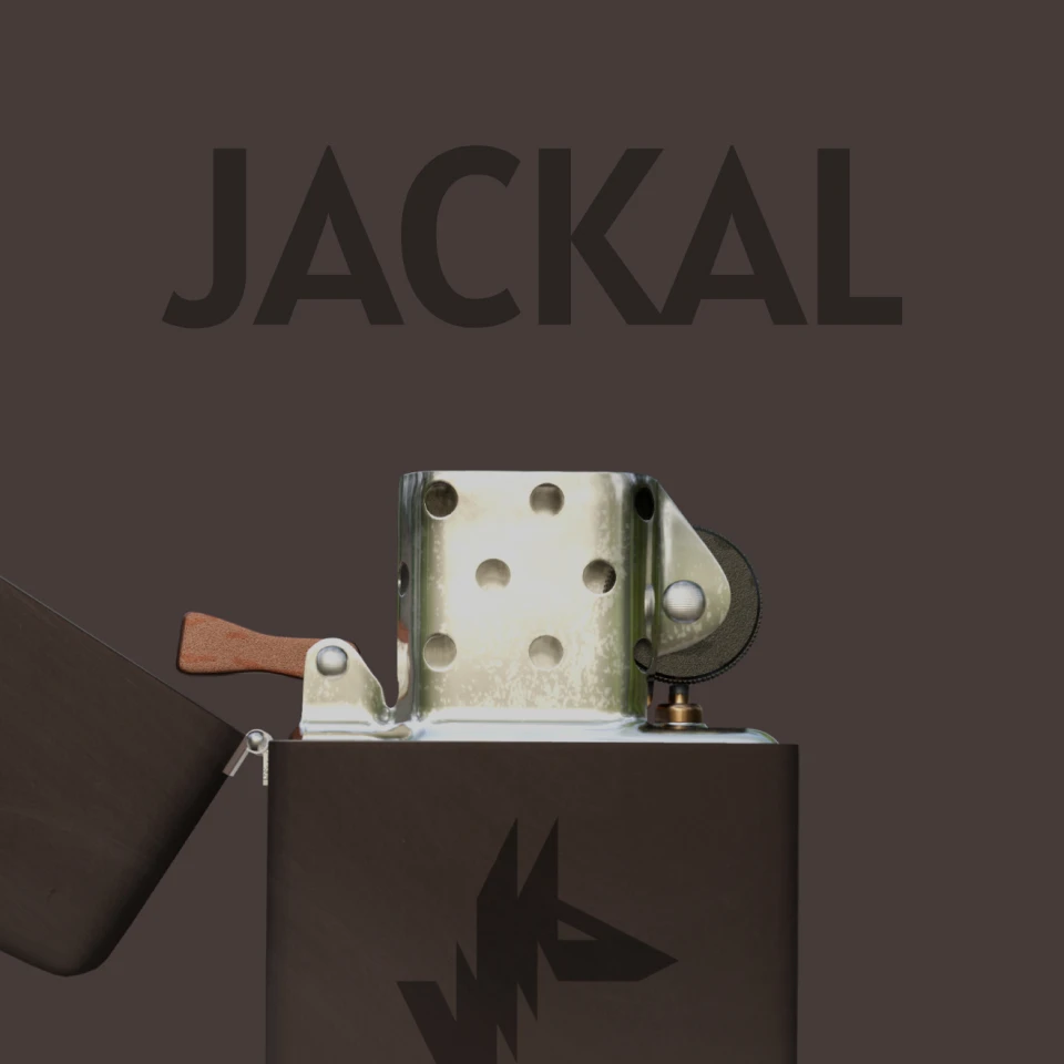
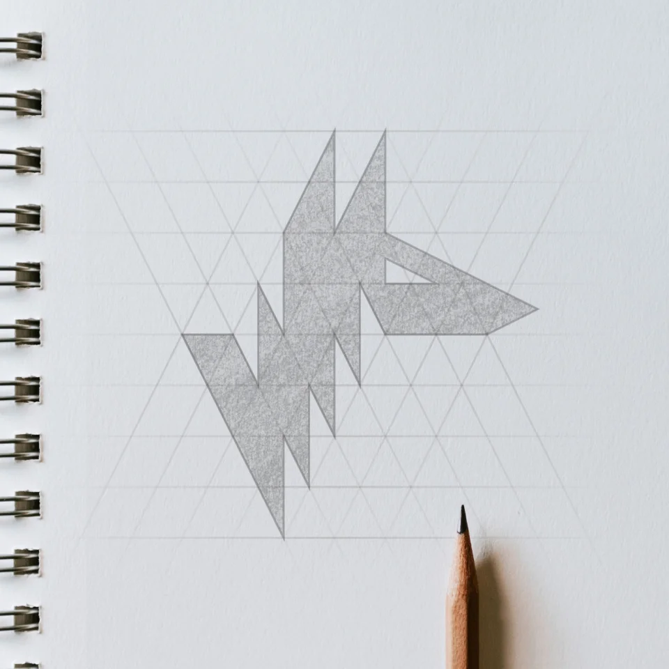
The logo is a stylized silhouette of a jackal in the shape of a “J” made from the same right triangle for consistency. The color palette is inspired by the coloring of the Golden jackal and the outdoors.
Wild & Free
Jackal inspires their fans to break the monotony of their day-to-day life and explore the unexplored, appealing to hikers, climbers, nature enthusiasts, fisherman, treasure hunters, cave explorers, etc.
Rough Around the Edges
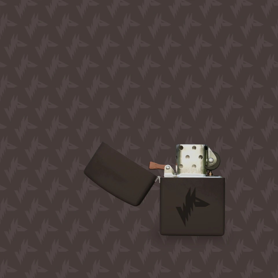
Jackal’s all about getting dirty, being outdoors and living life to it’s fullest. Each product is constructed with durability in mind to stand the test of time, and even get better with use.

Function First
Sometimes the best stuff isn’t the most glamorous… it just works. Jackal doesn’t want to be recognized for it’s beautiful products on a shelf. They seek to be praised when their product still works after having been left out in the elements for weeks on end.
Final Thoughts
Creating design elements for outdoor companies is my absolute favorite. The jackal mark is one of my favorite’s to date as it conveys so many different ideas with such simplicity. I believe the energy created throughout the brand just by using a simple right triangle is quite impressive.