Illustrious Llama
Illustrious Llama is a fictional production studio based in Boston, Massachusetts. They’re quirky, and they’re proud of it. “This industry is often far too serious, we believe it should also be fun.”
Logo & Colors
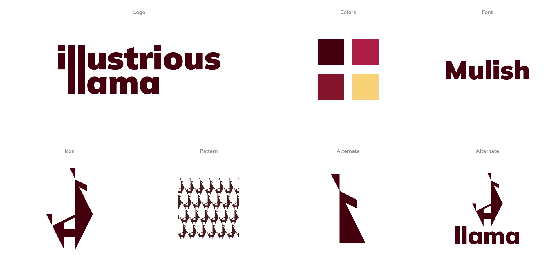
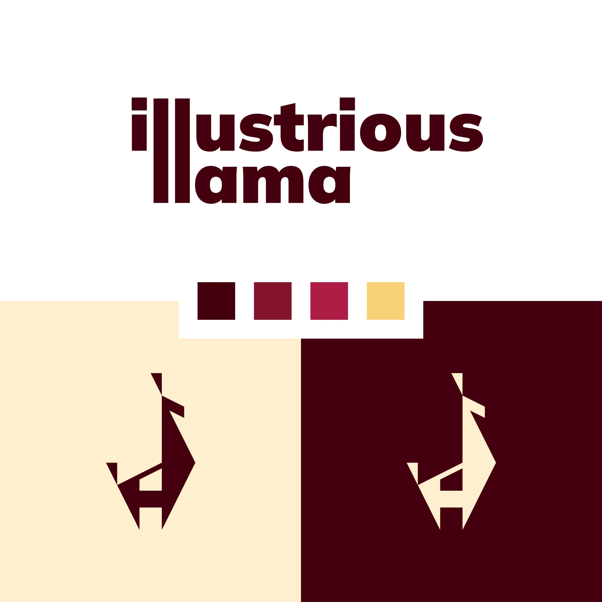
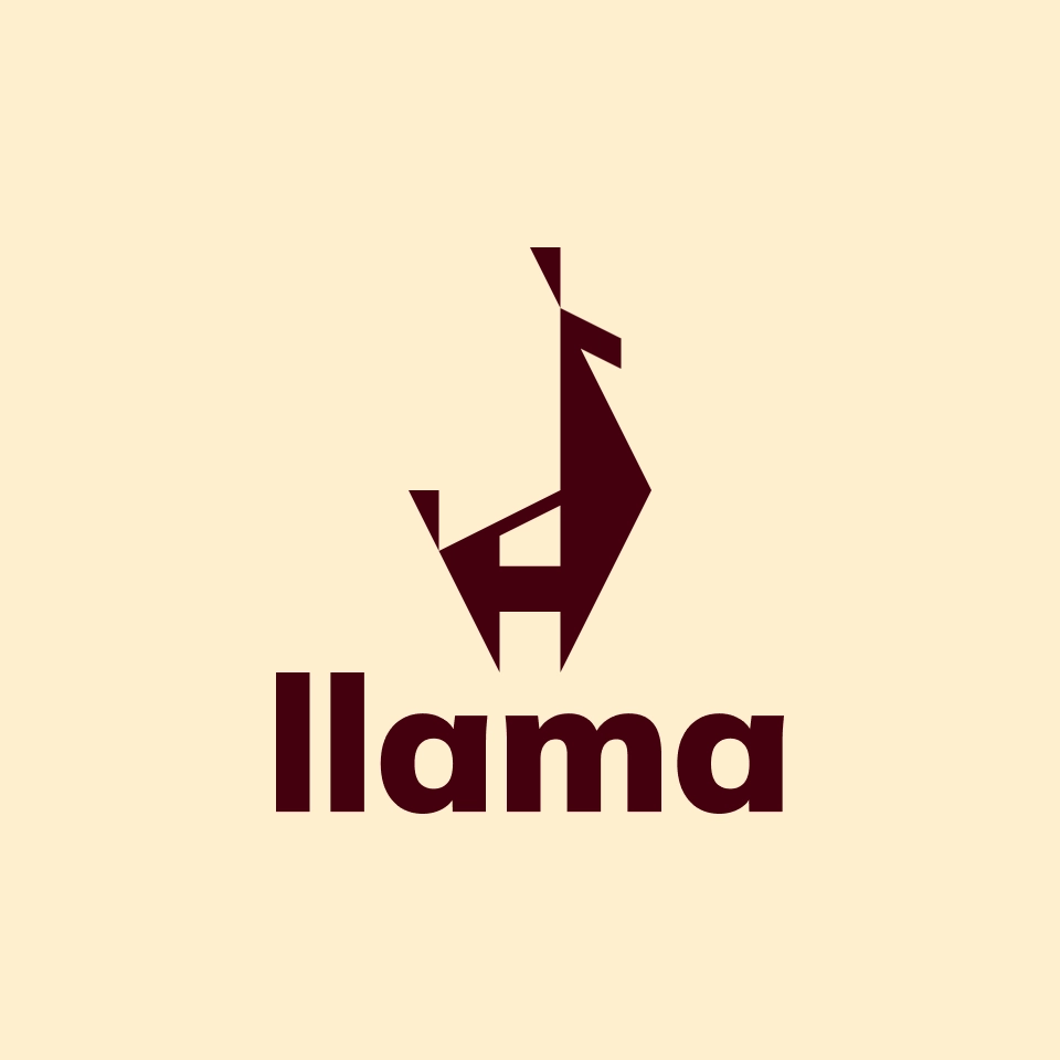
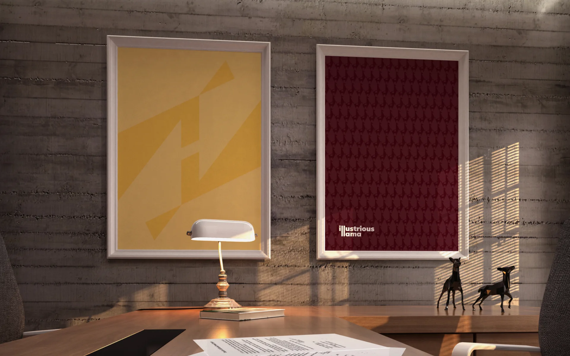
The logo is bold and quirky, representing a very proud llama and a lowercase “i” in the white space. The color palette is a bit more “expected”, which allows the quirkiness to come across as a pleasant surprise.

Fun & Quirky
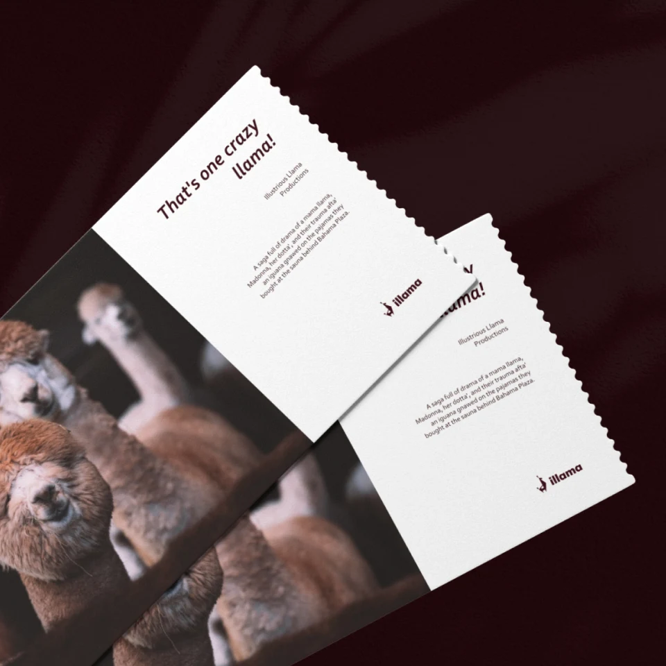
Illustrious Llama is not trying to fit in, they’re trying to stand out by embracing their uniqueness. The visuals and copy are designed to delight viewers, clients and even iLlama’s own employees. Pajama Monday’s, anyone?
Name Recognition
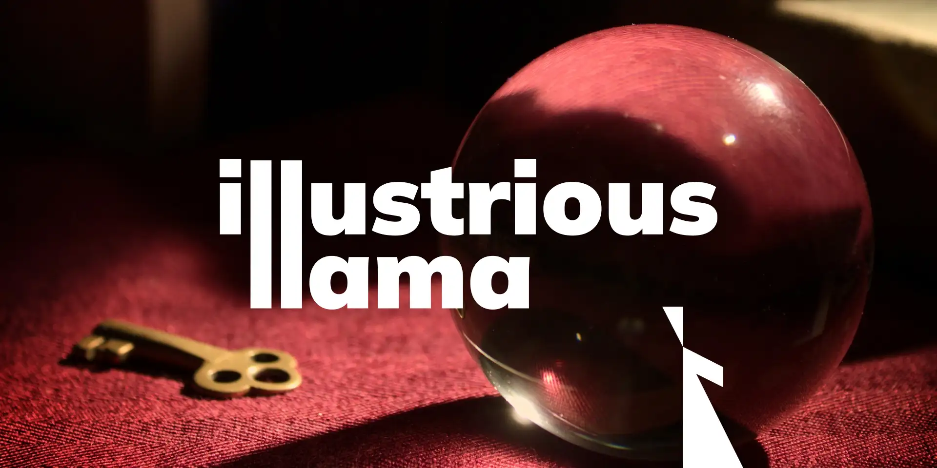
Although people likely won’t forget the Llama, it’s possible they may forget the “illustrious” part of the name. While not a huge deal, I came up with an idea…
Connecting the double “l” in both words of the wordmark could help jog people’s memory. Plus, it just looks pretty sick.


Geometric Llama
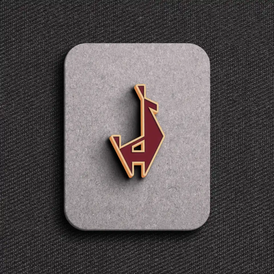
The llama mark was built entirely out of the same right triangle. (a height of “x” and a width of “2x”) Not only is this extremely satisfying, it also lends itself toward a visually pleasing mark that’s able to be used in countless patterns and designs.
Embrace the Llama
If you’re going llama, you may as well go full llama. They now have an office Llama who has been lovingly named Lionel, as he tends to keep the office a bit Messi.
Final Thoughts
The concept for this design came easy, but the execution took a lot of hard work. The typography and the logomark was the final piece of the puzzle, but I’m thrilled with the level of cohesion throughout every asset and their use.
This project was fun. I very much enjoy using humor in my design work. And when you’ve got a llama as a muse, it’s hard to miss the mark.
