Gamebreak

Logo & Colors
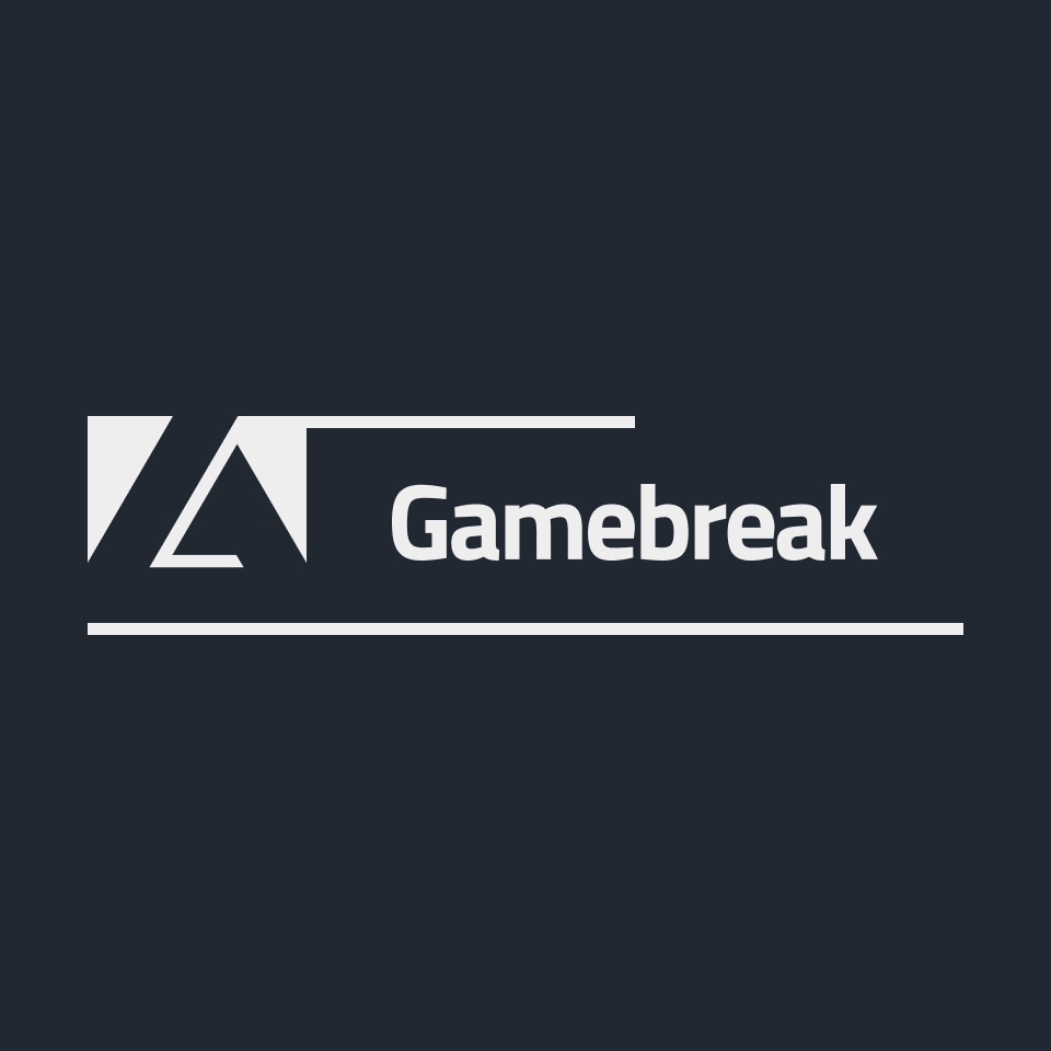
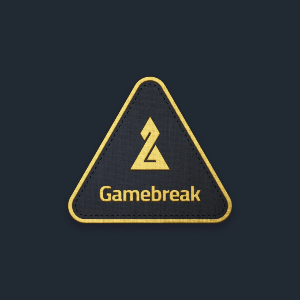
The logo is bold and angular. It reads as a traditional board game pawn with a bit of a twist forming a “G”. The color palette feels both serious and energetic, alluding to the competitive nature of Gamebreak’s games.

Fun & Competitive
Are you tired of never-ending Euro games lacking theme and beauty? Or bite-size Ameritrash games lacking depth and competitiveness? Gamebreak aims to hit the middle of that Venn diagram.
[Not All] Fun & Games
Gamebreak is targeting gamers who aren’t afraid of a little depth and strategy, so the identity aims to convey the (slightly tongue-in-cheek) message, “We’re all here to have fun, but also… you’re going down!”

Highlight the Differences
Gamebreak is comfortable challenging the status quo, so their ads and marketing material will focus on standing out, embracing how much they differ from their competition.

Final Thoughts
It’s quite fun working with a brand who’s not afraid to stand out from the pack. I was able to research the competition and pinpoint key areas where it made sense to “zag”.
The mark and the logotype have more than enough personality to be used separately. And although the two are visually distinct, they pair nicely due to a few subtle cues.