Faction 411
Logo & Colors
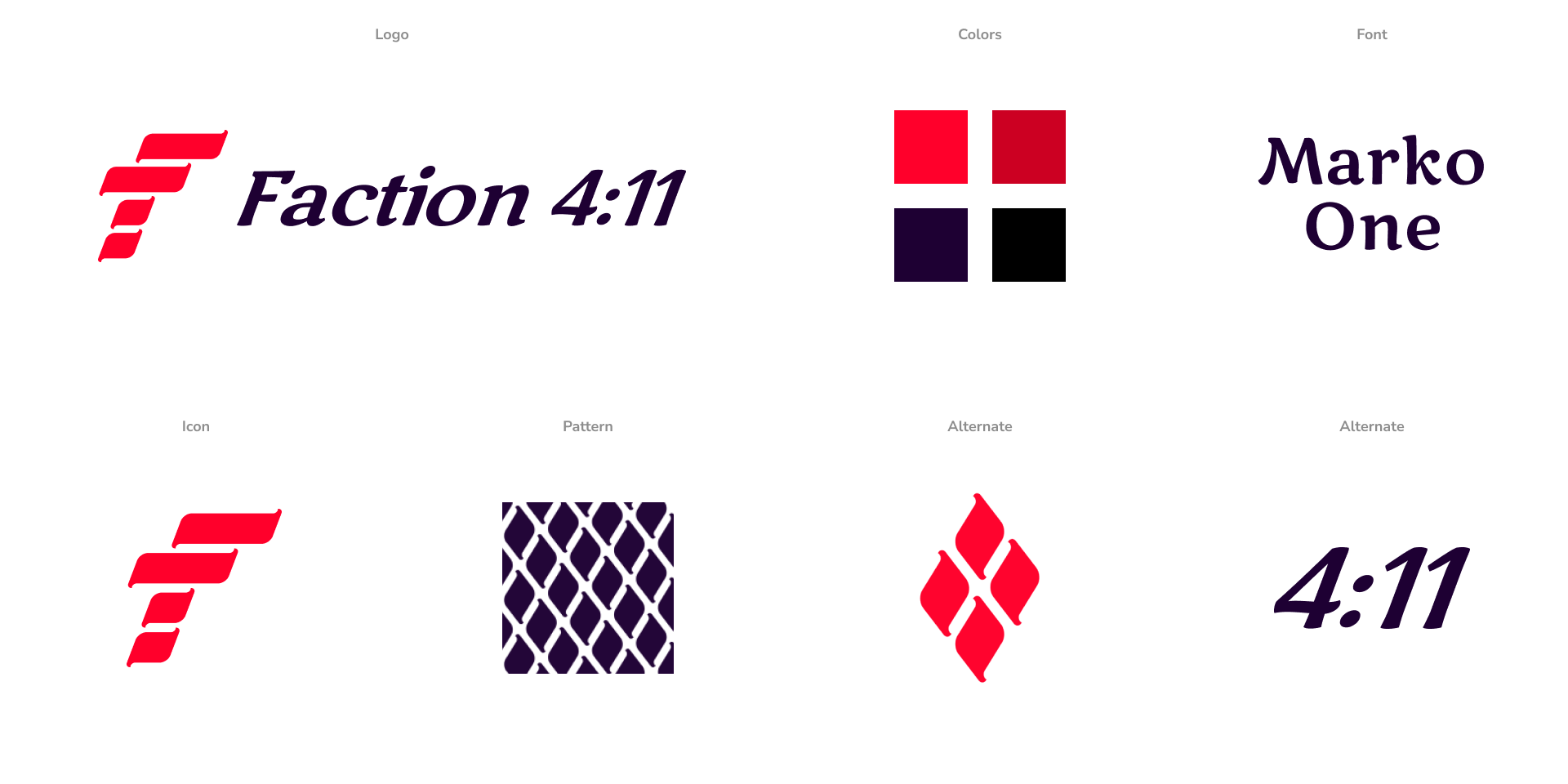
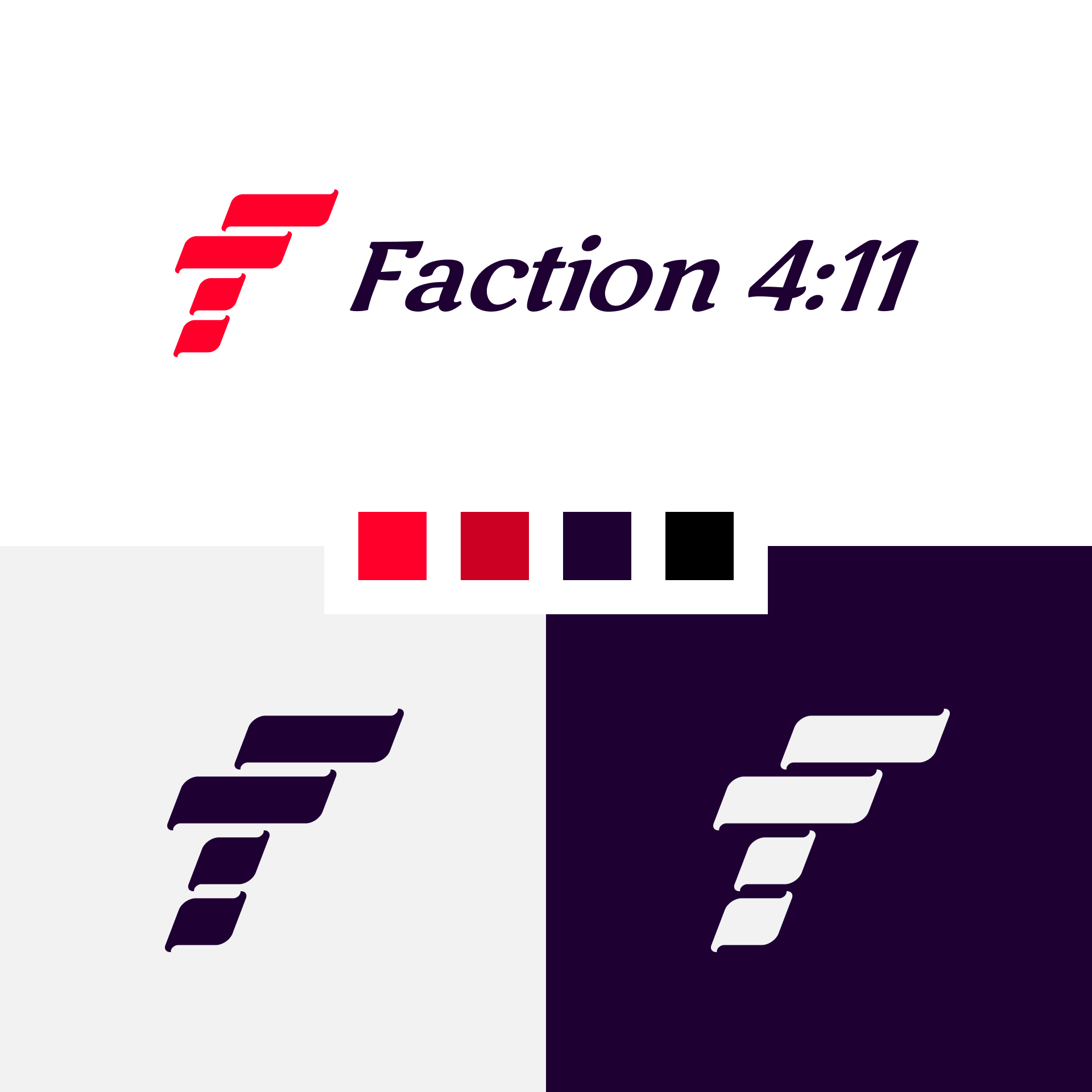
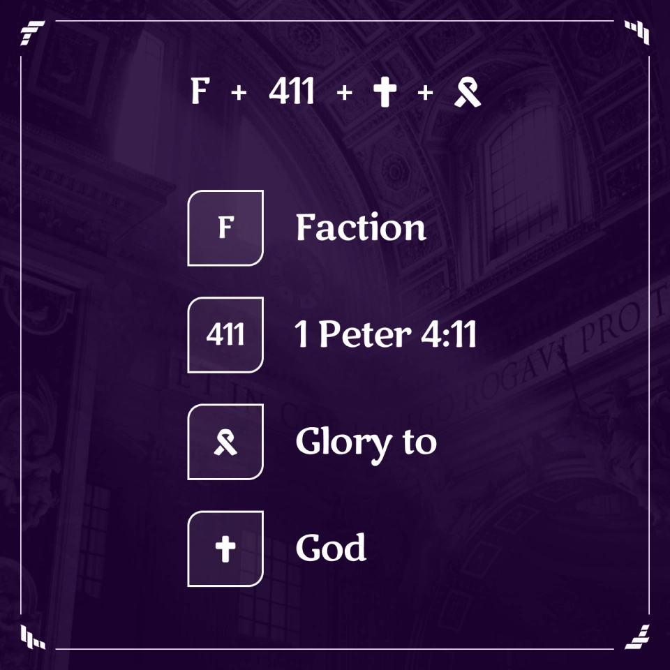
The logo is bold, simple and striking. It combines an “F”, a ribbon draped on a cross, and the number “411” when tilted on it’s side. The color palette represents the intensity and passion within the mission.

Simply Elegant
The mark is able to convey so much with just 4 shapes. The toughest part of this brand was displaying the tension between passion and empathy. The subtle mixing of curves with points in each asset helps convey that tension.
Powerful Message
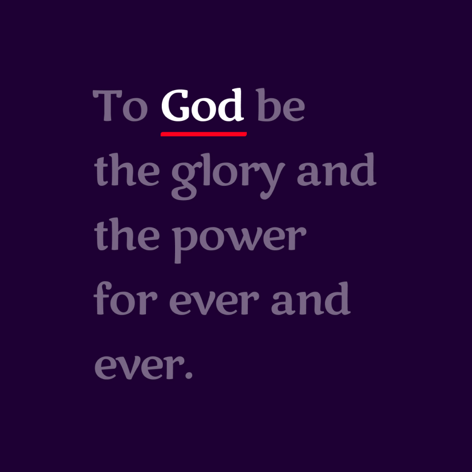
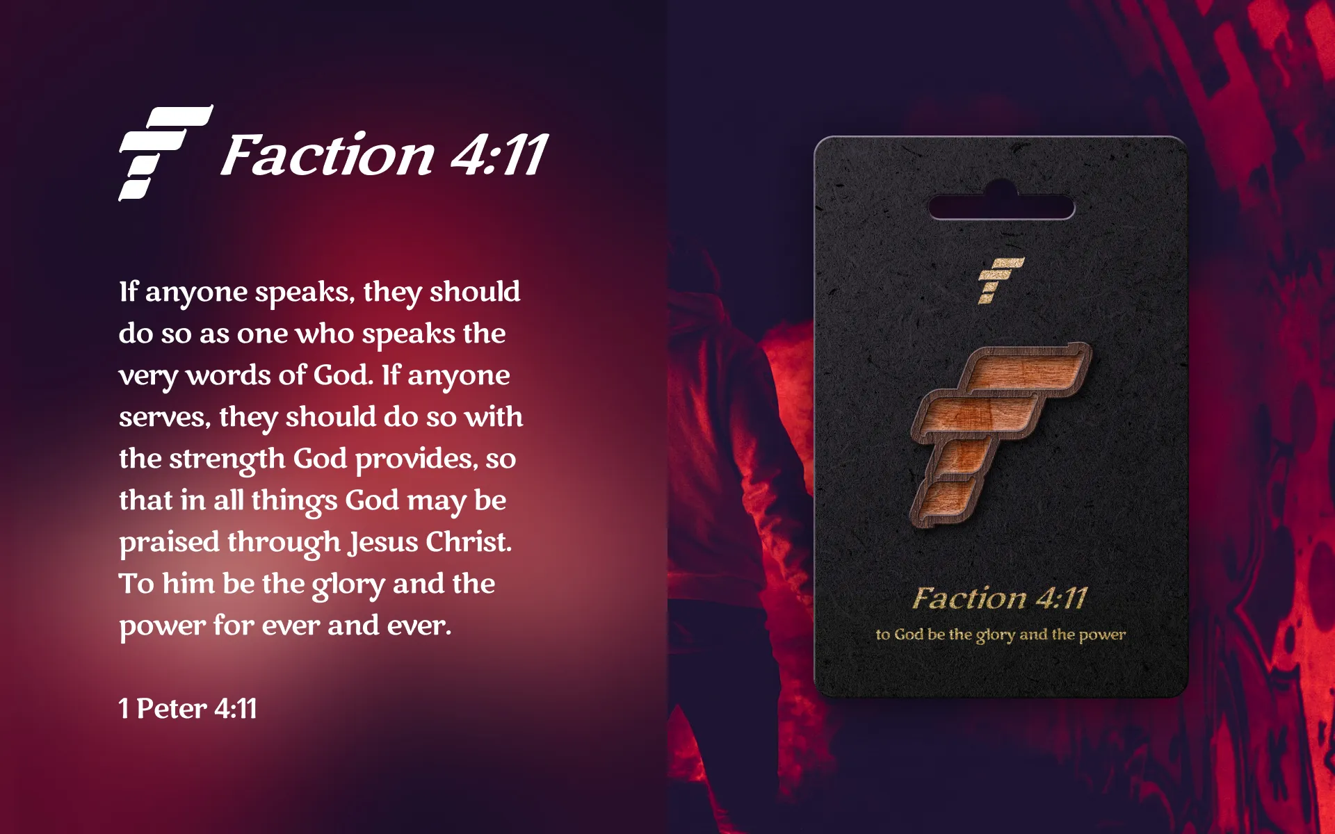
At the heart of the brand is 1 Peter 4:11, so I came up with several different ways to display that messaging depending on available space. The message should always be crystal clear.

Worth the Effort
The main mark took a long time to get just right, but that’s often the nature of simple icons. Once the mark was completed, the alternates, patterns and shapes sort of fell into place.
Final Thoughts
Working on ultra passionate brands is exciting, but it’s also hard work. I find it takes a different process all together to get into a flow on these. I typically like to work in bursts, but projects like this tend to require long sessions of intense focus for best results.
The mark itself is probably the part of this identity I’m most proud of as I feel it captures the essence of the brand perfectly while being so incredibly simple.
