Digital Gemstones

Logo & Colors
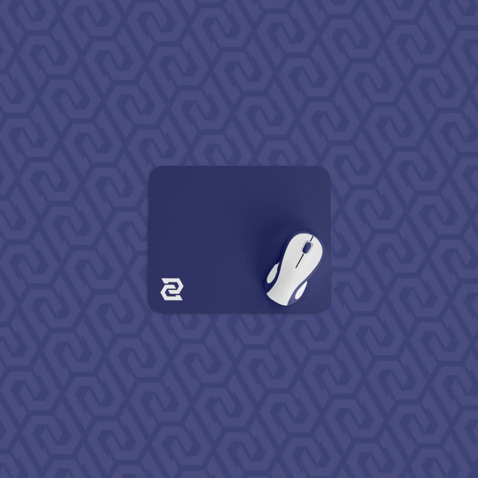
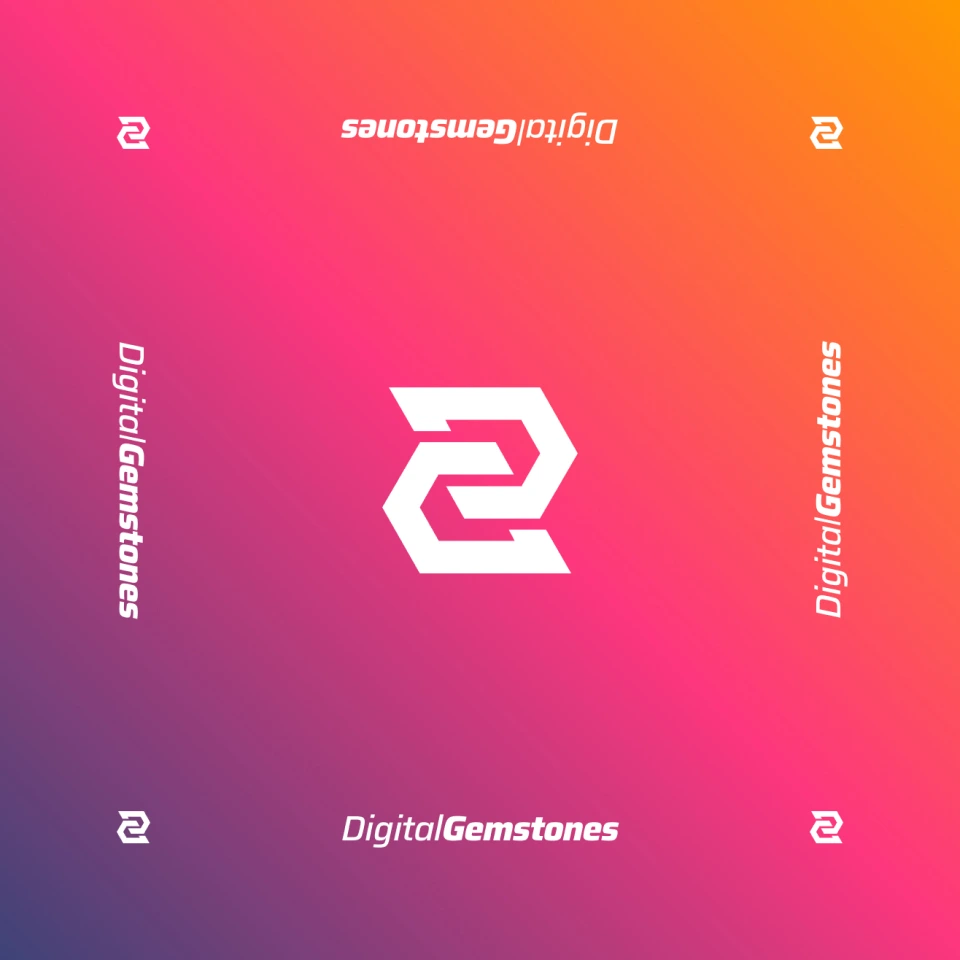
The logo is sharp and angular. A “DG” monogram is made up of two identical letters representing a gemstone. The color palette is vibrant and energetic, but can also be dialed back to bring the digital assets to the forefront.


Striking & Useful
The intent is to stand out without coming across as all style, no substance. Digital Gemstones wants to appeal to creatives without upstaging them. They believe they’ve got the most valuable digital assets on the web.
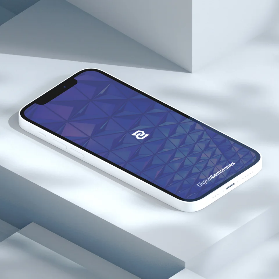
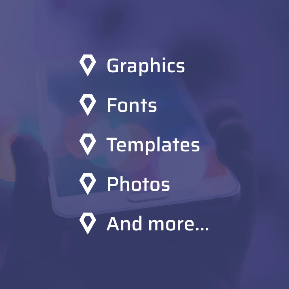
Purple is Pleasant
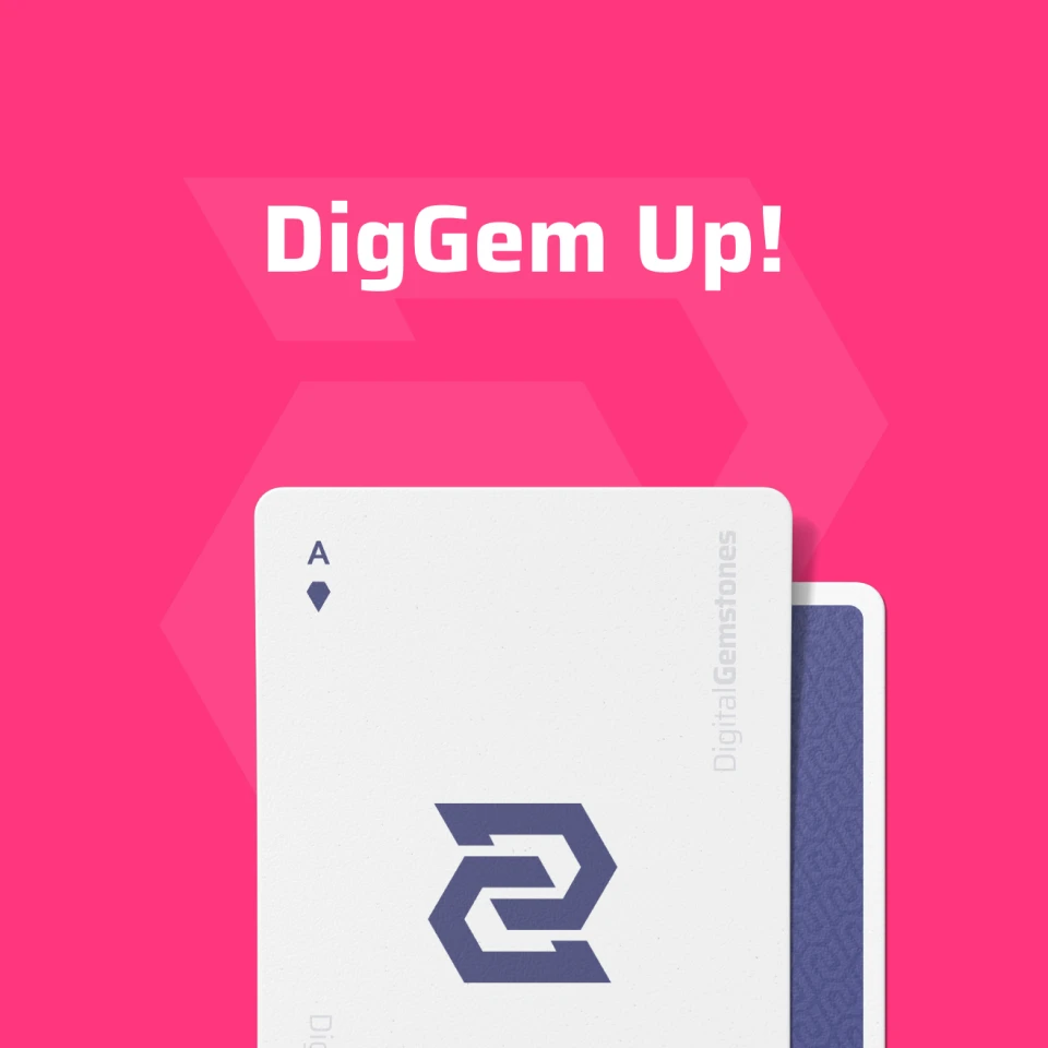
When the showing off / selling their digital assets, the brand will stick to their purple color for cohesion and use the pink sparingly for marketing and clickable elements.
No Rough Stuff
Digital Gemstones is only focused on the best digital assets. It’s important that the brand come across as premium yet affordable, confident yet approachable and current yet established.
Final Thoughts
Monogram logos have a tendency to come across as old-school, boring or unoriginal… but I like a challenge. My monogram design style tends to focus on the aesthetics of the mark itself over the recognition of the letters.
I was quite pleased when I discovered I could utilize the same gem shape for both letters. The simplicity of the mark is it’s x-factor.