Croc & Key
Logo & Colors
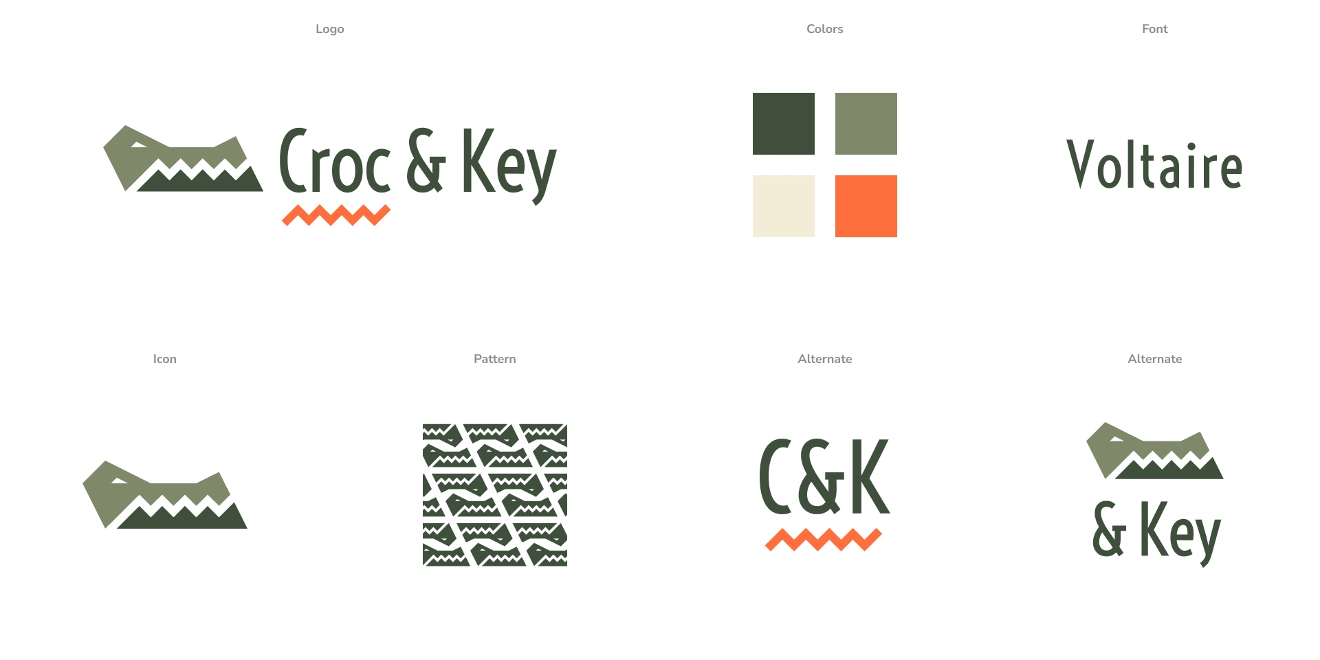
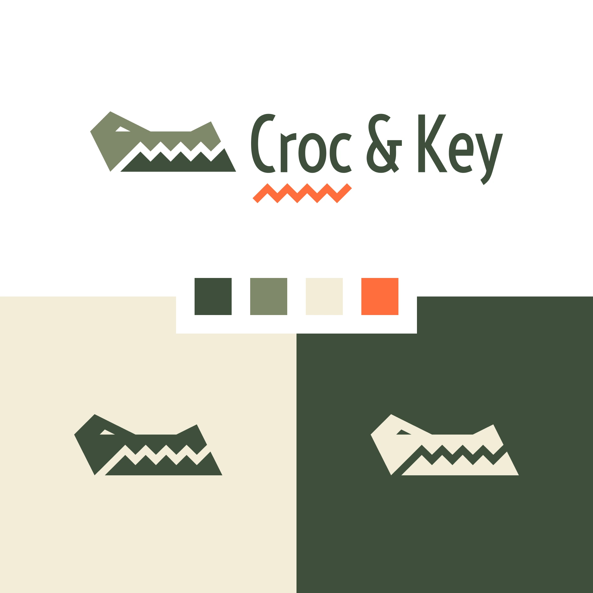
The logo is bold, modern and simple, representing both a crocodile’s head and a key entering a lock. The bold color palette based on crocodile coloring differentiates Croc & Key from the stagnant local competition.


Versatility is Key
Since the main mark needs a bit of horizontal room to breath, it was important to create alternate versions to be used on more restrictive mediums.

Slick & Professional
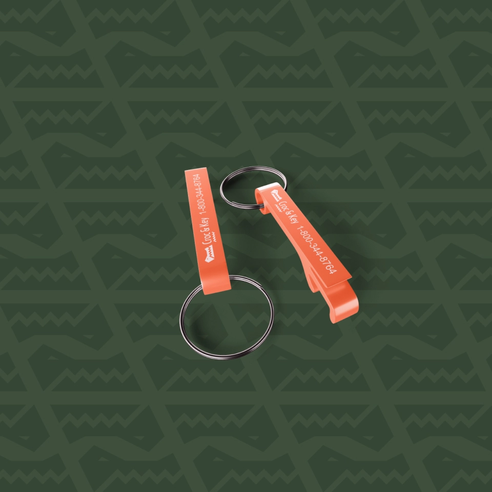
Several unique iterations of the logo were created to ensure C&K’s branding could work within any context. A custom polo was designed for the employees and a bottle opener keychain was suggested for marketing to customers.

Final Thoughts
One of my favorite aspects of this design is the “squiggle” that was created from the space between the croc’s teeth. It could represent the teeth of a key, the teeth of a crocodile or a crocodile’s swimming pattern.
The best part was it coming up so unexpectedly. I typed out the word “Croc” and the software underlined it with a red squiggle, thinking I’d made a spelling error. I instantly knew I had to incorporate it!
