Top 10 Underrated NBA Brands
Underdogs FTW
Even casual NBA fans recognize most of the major media market team logos, colors and brands. That being said, many of those teams rely on tradition and name recognition rather than taking risks with their brands.
“If it ain’t broke, don’t fix it” is all well and good for those at the top… but where’s the fun in that?
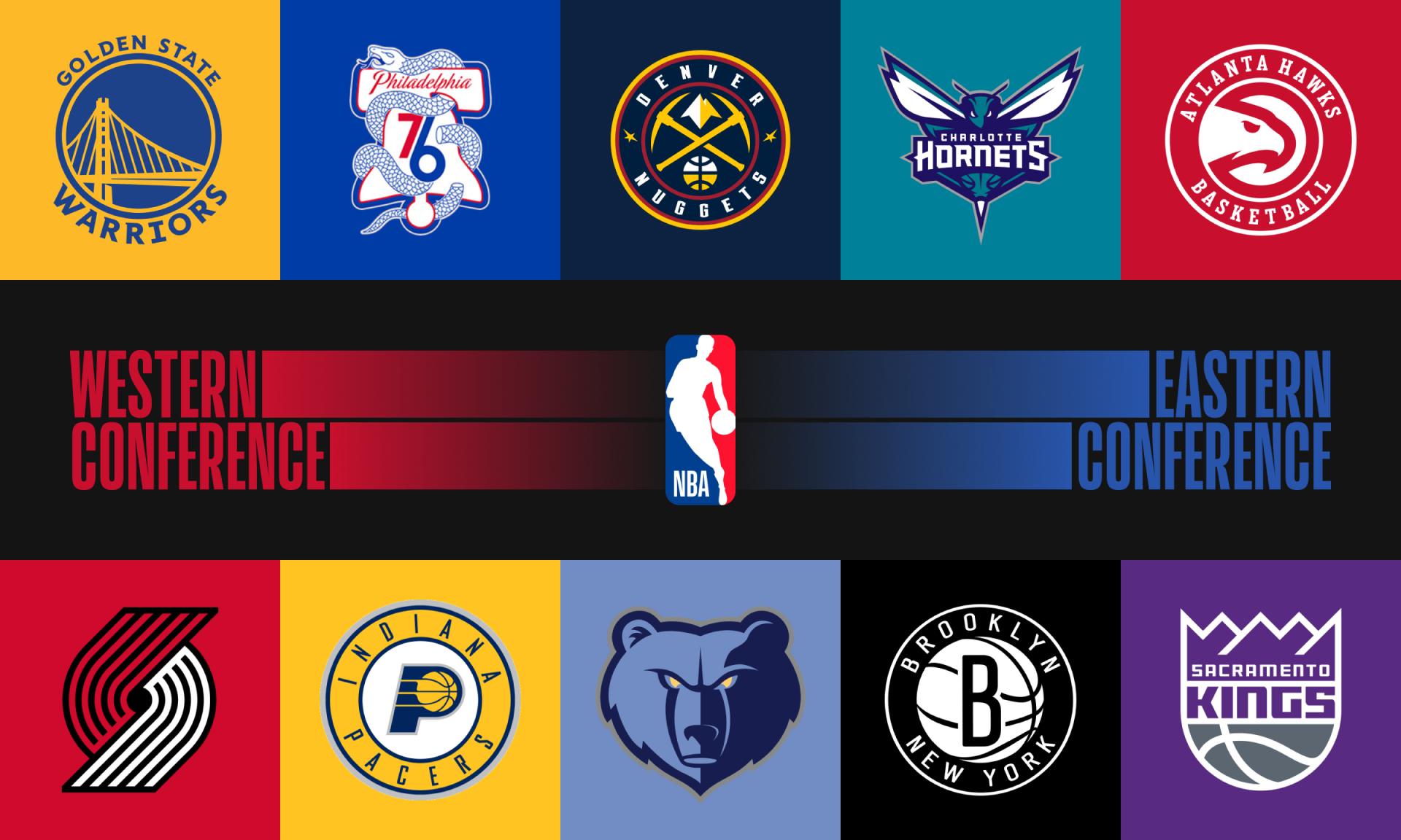
Below are 10 teams willing to shake it up, creating brands that die-hard fans can be proud of year after year.
#10 | Portland Trail Blazers
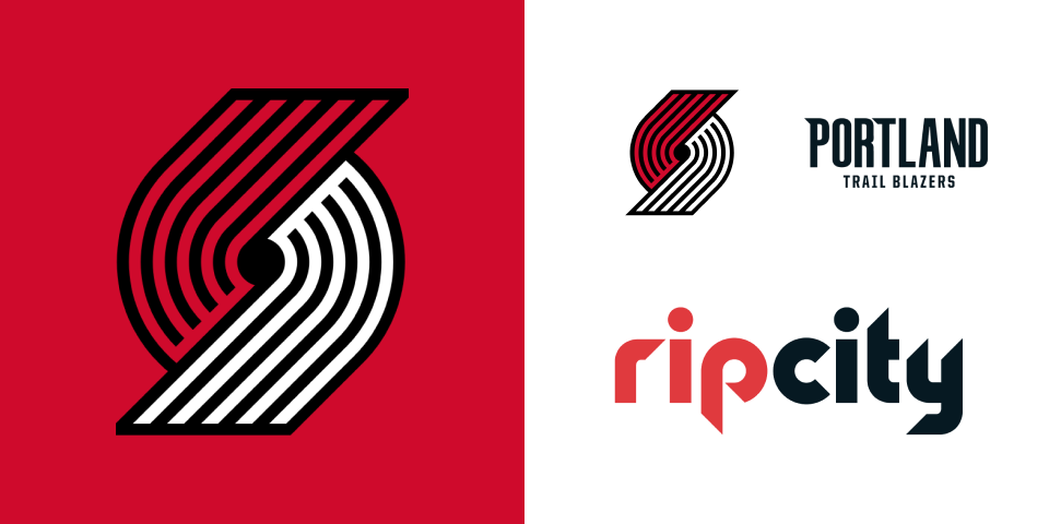
It’s tough to go wrong with red, black and white. Although many of Portland’s updates have been minimal through the years, their simple yet striking mark is instantly recognizable in all it’s forms.
The Blazers may be losing Lillard this offseason, but PDX fans should be thrilled with all the young talent on their squad. Either way, you can bet these fans are excited to rep Rip City.
#9 | Memphis Grizzlies
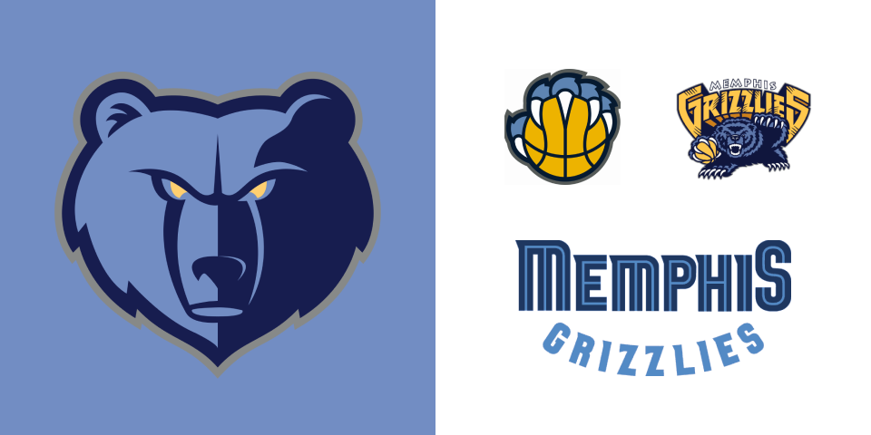
The current grizzly mark and the alternate paw on ball mark are probably the strongest one-two punch in the league. Simple, strong, balanced, look outstanding in black and white… just ridiculously versatile.
Not to mention, Grind City has to have one of the coolest retro logos, and bonus points to them for still utilizing it here and there.
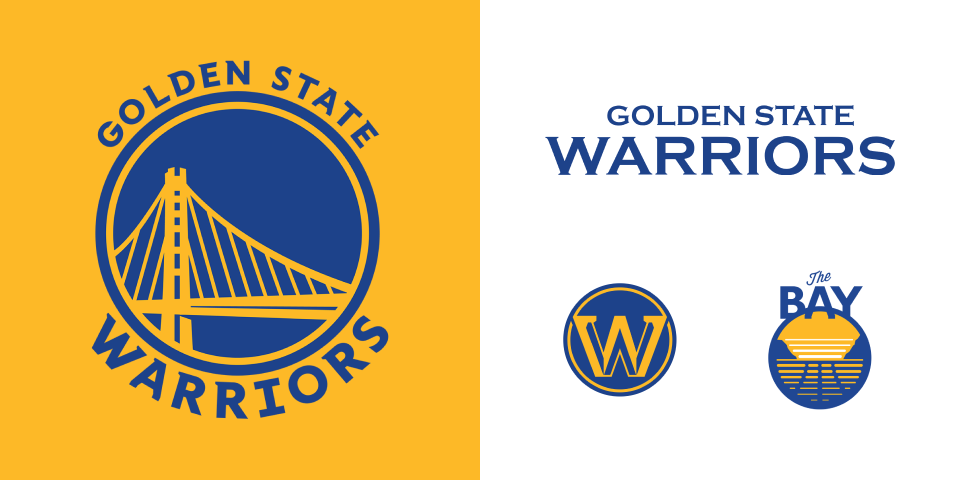
#8 | Golden State Warriors
The Golden Gate Bridge mark may not be super simple, but it’s beautifully balanced and the color scheme is nice and vibrant much like “The City” or “The Town” itself.
The Warriors have shown a willingness to try new things through the years and most of their efforts have yielded excellent results. The previous logo was so bad, we should all be thankful it’s gone.
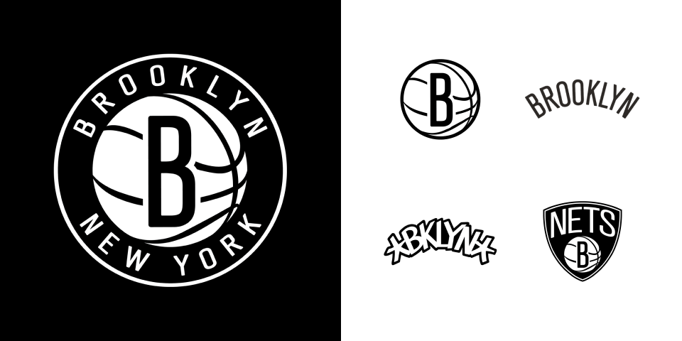
#7 | Brooklyn Nets
I know this one rubs some people the wrong way, but I think it likely plays wonders for their target audience. I love the choice to go back to basics with the black and white and no-nonsense typography, as it immediately sets them apart from the Knicks.
They took a huge risk going against the NBA grain with this rebrand, and for that, I commend them. It may not be for everyone, but I bet most remember it.
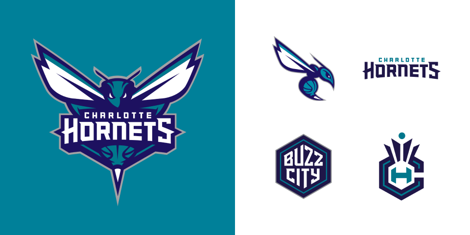
#6 | Charlotte Hornets
I’ll take Hornets > Bobcats all day long. From the many alternate logos, to the honeycomb floor, to the nickname “Buzz City”… Charlotte is attempting to check all the boxes, and I’d say for the most part, they’re succeeding.
No matter what you’re into, if you’re a fan of the Hornets, I think you’ll be able to find some sweet merch to rock at the next home game.
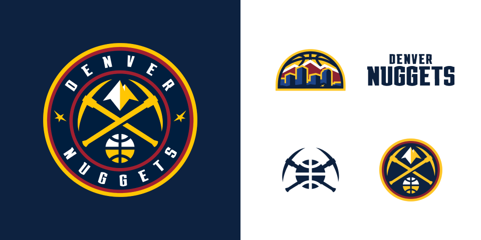
#5 | Denver Nuggets
Denver’s color palette and unique imagery really set them apart from the rest of the league. I appreciate how many iterations of they have using just 4 different elements (pickaxes, mountains, the skyline and a basketball)
It’s different, but everything about it feels intentional. They don’t mess around when it comes to design in the Mile High City.
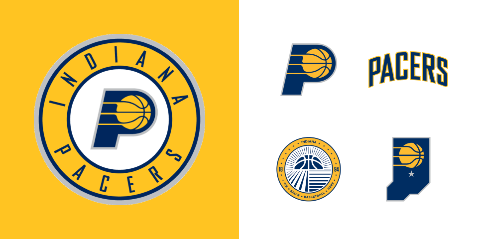
#4 | Indiana Pacers
I’ll admit, the “P” logo is one of my favorites. It may be a tad “unoriginal”, but it’s so simple, so recognizable, so versatile and hints at something I’ve always associated with the Pacers… stripes.
This is just a perfect example of a team/company not being afraid of simplicity. They also don’t have many design skeletons in their closet. They seem to move very thoughtfully and intentionally where design is concerned.
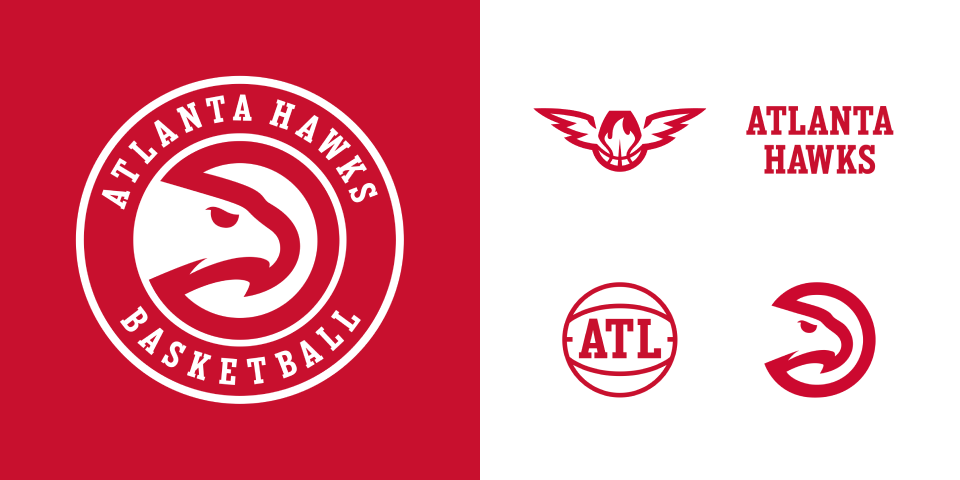
#3 | Atlanta Hawks
Atlanta is sure not afraid of a brand refresh. And though they may have a few in the history books they’re not proud of, this current iteration is excellent!
From the two-color palette, to the circle hawk, to the letters in the ball, to the slab-serif wordmark, everything about their current branding is simple and it just works. This simplicity allows them to take chances elsewhere with photography, patterns and designs.
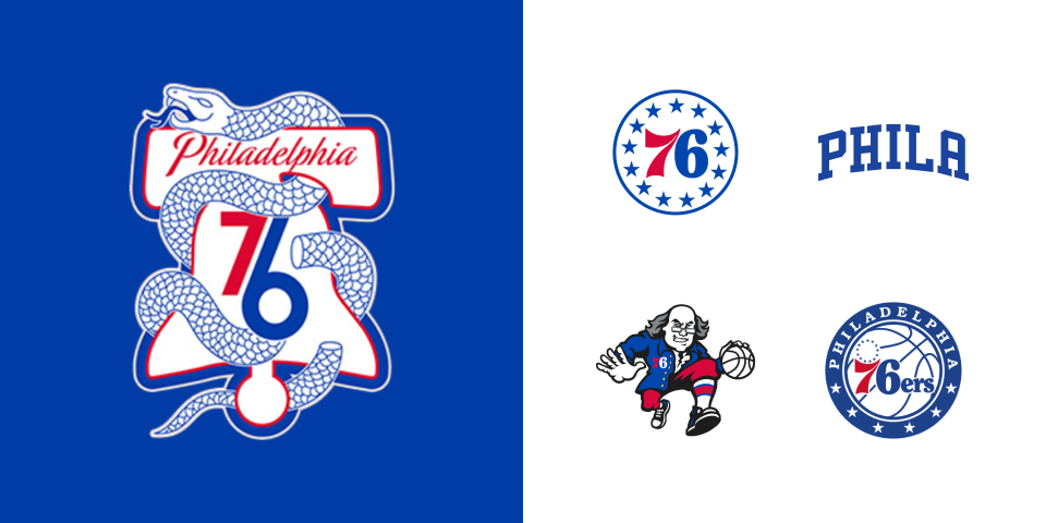
#2 | Philadelphia 76ers
Although Philadelphia is a major market, I still felt compelled to include them on this list as I feel their branding is woefully underrated… just look at that snake + bell mark, would you?
The Sixers have one of the most versatile brands in the game. You know you’ve succeeded when all you’ve gotta do is throw a two-digit number and some stars on there and people know it’s you.
Gorgeous designs, patriotic color palette, hardcore retro flavor, stunning typography… Philly fans are spoiled.
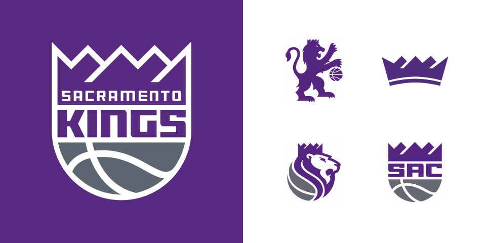
#1 | Sacramento Kings
Light the Beam! The Kings most recent rebrand is immaculate! Everything is simple, memorable, edgy and harkens back to the past perfectly. All the different marks give fans a treasure trove of apparel to dig through when going out on the town.
Though there are so many different marks, the crown and the color palette tie them all together perfectly. The Kings finally made it back to the playoffs last year and there is a new energy around the city/team lately. Gotta think you’ll be seeing these designs all over the place moving forward.
Branding In Sports
I’m always so excited to check out the latest rebrands across the wide world of sports as this is an area I focus on as well. Huge shoutout to SportsLogos.Net for having all the NBA branding assets in one place.
If you’re interested, you can check out some of my work here. Feel free to reach out if you have any questions or would like help with your next rebrand.
