Kristin Tattar

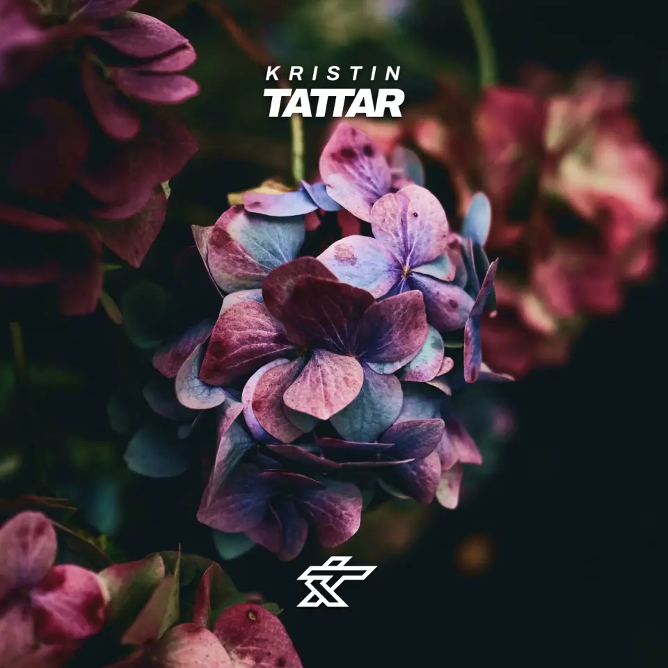
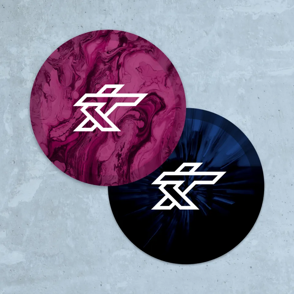
Logo & Colors
The logo is bold and easily recognizable, combining her “KT” monogram with a symbol resembling a disc golfer in the throwing motion. The color palette conveys her down-to-earth, professional yet approachable nature.

Driven & Dedicated
Kristin is a natural athlete, entrepreneur, coach and family-woman who’s drive is almost unprecedented in the blossoming sport of disc golf. She’s focused on growing and pushing the sport to new heights, on and off the course.

Straight Lines
Kristin’s authentic, honest, to-the-point nature as well as her pinpoint accuracy and unreal consistency on the course has made her a fan favorite. Straight lines are used all throughout the brand to represent both the player and the play.

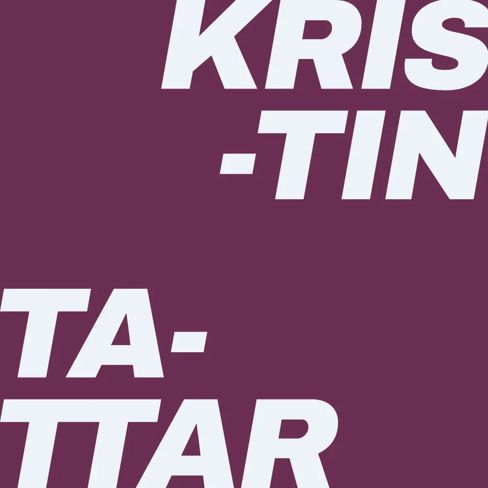
Fun w/ Typography
Separating both the first and last names into syllables created a very interesting lockup that can be used on its own or as a frame to show off images/products.
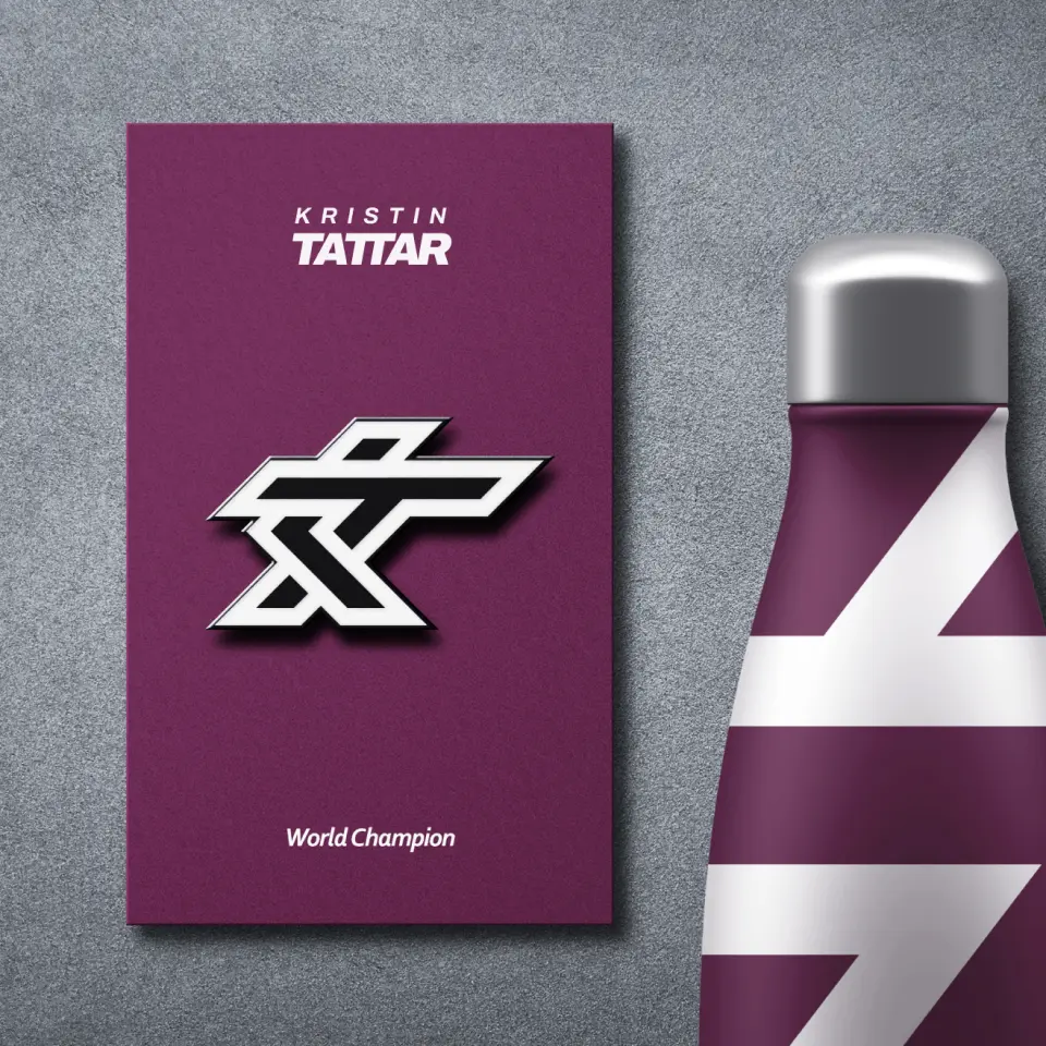
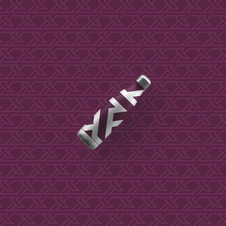
Disc Golf Merch
Sports merchandise is probably some of my favorite merch to brainstorm/design. A pin for your bag, water bottles, hats, discs are just the tip of the iceberg for disc golf merch ideas.

Final Thoughts
It’s no surprise to me that I had a blast working on this project. Athletic brands are probably some of my favorite to work with because I like to consider myself an athlete (or at least an athletic individual), as well as a sports fanatic.
I’m most proud of how each asset came together as part of the bigger brand identity. The color scheme, typography and general feel of the mark itself just feels correct.